Non-Conditional States
Page states provide developers with a versatile solution for dynamically applying a variety of changes to Pages. This feature is particularly useful for modifying the user interface (UI), styling, and other properties on the fly. By leveraging Page states, developers can tailor Pages to meet specific privileges, qodlysource values, contexts, or scenarios without relying heavily on server-side processing.
State Characteristics
Each state is defined by its differences from the original Page, known as the Base state. The key characteristics of these states include:
Dynamic UI Customization:
Conditional Visibility: Adapt element visibility to user inputs or conditions.
ExampleIn an online survey tool, questions are displayed or hidden based on previous answers.
Style Modifications: Apply dynamic style changes, such as color or font adjustments.
ExampleA music streaming service changes the theme and colors of its user interface based on the genre the user is currently exploring.
Interactive Elements: Modify properties like "Read Only" in components based on current state.
ExampleOn a real estate website, property listing forms change to 'Read Only' mode once the listing is published.
User-Centric Design:
Tailored Experiences: Configure Pages for varied privileges.
ExampleIn a company intranet portal, the Page displays different fields for submitting IT requests based on whether the user is an employee or a department head.
Real-Time Feedback: Offer instant UI updates as users interact.
ExampleA financial application provides immediate updates in investment forms, showing real-time calculations of potential returns or risks based on the user’s inputted investment amounts and choices.
Reduced Server Load:
Client-Side Logic: Process most of the conditional logic on the client side, reducing server requests.
ExampleAn online custom product builder, like for custom t-shirts, processes user selections like size, color, and design on the client side, quickly showing them a preview without needing to communicate with the server.
Faster Response Times: Achieve quicker UI updates, enhancing user experience.
ExampleA flight booking website rapidly updates available seats and prices as users filter their preferences, such as departure times and airlines, without reloading the entire page.
Note that states only apply styles. No additional function calls are possible compared to the Base Page.
State Classifications
Pages typically operate in one of two primary states:
Non-Conditional State
In the Non-Conditional State, the Page functions according to its Base State, operating in its standard form without any special conditions or triggers. This represents the default layout and behavior before any specific conditions are applied.
Conditional State
The Conditional State activates when predefined conditions are met, unlike the Non-Conditional State. These conditions are based on criteria such as privilege levels or qodlysource value changes. The state changes dynamically, triggered or deactivated according to the evaluation of these conditions as TRUE or FALSE.
For additional details on how to implement the Conditional State, please refer to the Conditional States section.
States Management
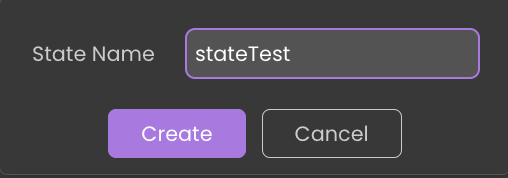
Creating a New State
 button in the states section.
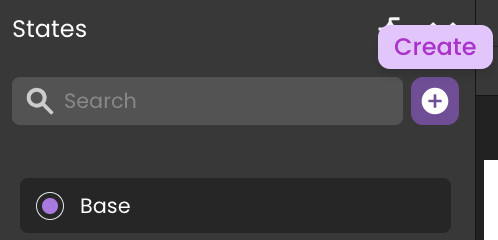
The selected state is highlighted with a checked box
 in the states list.
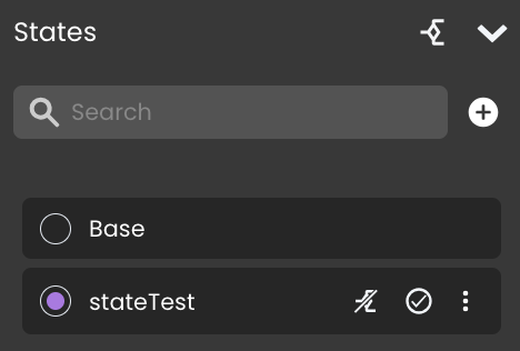
There is no restriction on the number of states that can be associated with a single Page.
Editing a State
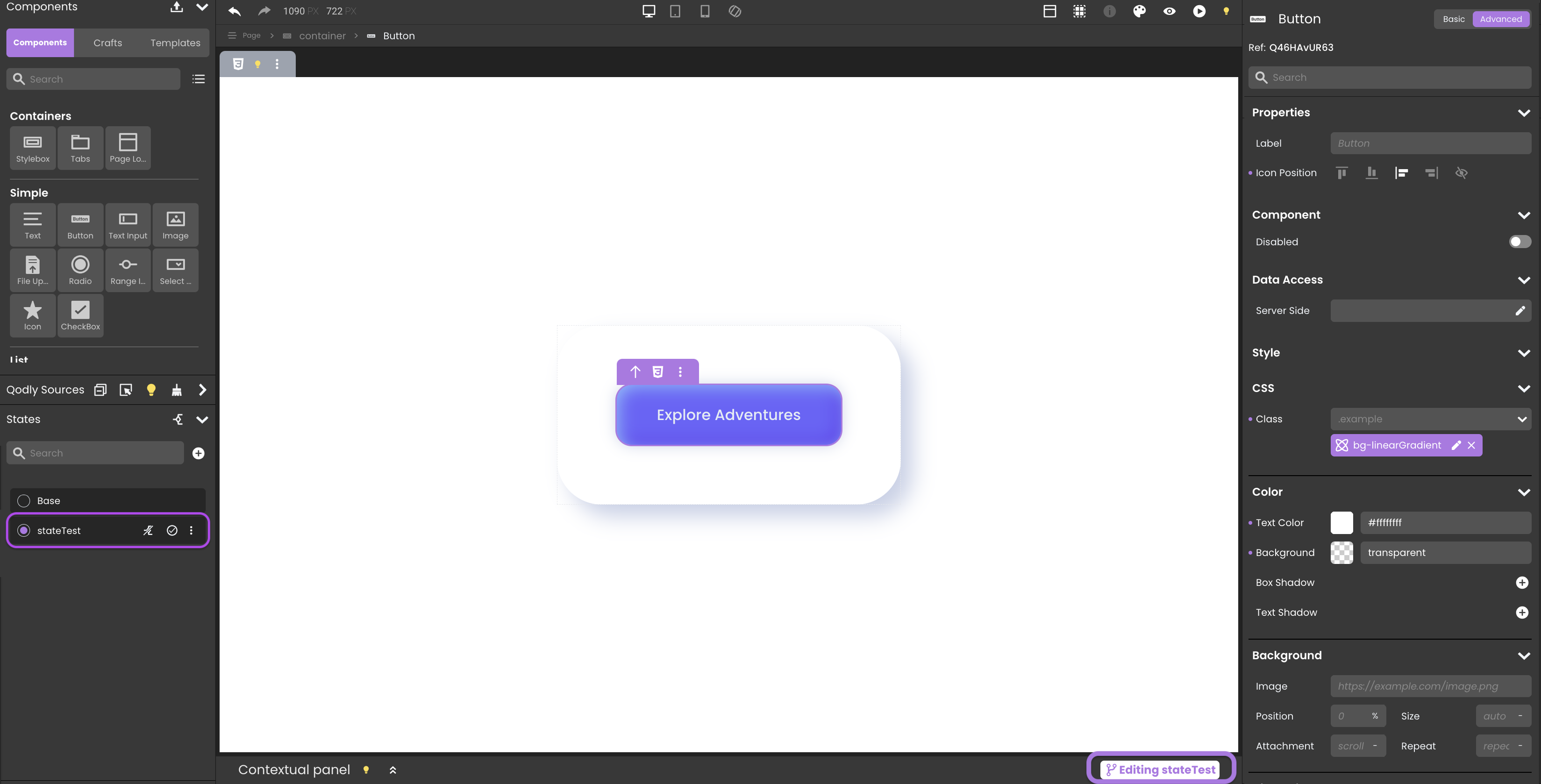
Start editing a state by selecting it from the states panel, which then opens it on the canvas for customization. Notably, the Editing stateName tag will appear at the far right of the Contextual panel's header, indicating the current state under modification.
The editing process involves:
CSS Class Editing: Alter CSS classes linked to components.
tipClearing styles is allowed on states because modifying styles is permitted.
Component Visibility: Dynamically display or hide components.
infoAdding or deleting components is not allowed. This limitation is reflected by disabling specific keyboard shortcuts like remove, cut, paste into, clear content, duplicate, and clear styles.
Component Properties: Adjust component properties with limitations to ensure state integrity. All styling properties (e.g., color, font) can also be modified.
infoTo maintain state integrity, the "Data Access" category within component properties is deactivated during state editing.
Contextual Panel Update: The panel reflects the current state being edited, providing relevant information and limitations.
infoInitially, the contextual panel notes that
You can only view/modify CSS classes when editing a state.Airy Mode: Enable or disable airy mode settings for specific states.
Qodly Source Restrictions: On a state, no qodlysources can be dragged and dropped on components on the canvas.
Removing a State
 button located adjacent to the state's name within the states panel.
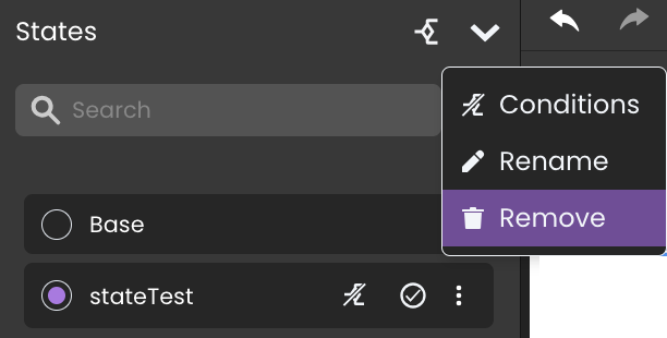
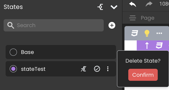
Once a state is successfully deleted, it is automatically disassociated from any related standard actions it was previously involved in. This includes the removal of the state's tag from the states field.
Renaming a State
 button located adjacent to the state's name within the states panel.
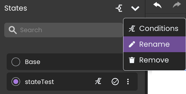

All references to the state in the events are automatically updated post-renaming, preserving the Page’s functional integrity.
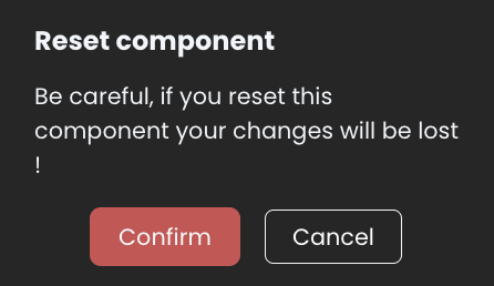
Resetting State Changes
Reset button allows users to revert any changes made to a component back to its original settings from the Base state.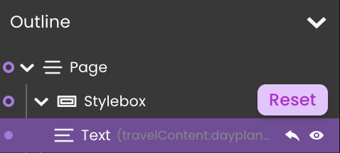
Steps to Reset a Component:
- Locate the Component: Find the component in the Page outline.
- Click the Reset Button: This button appears as a circular arrow icon next to the component.
- Confirm Reset: When prompted, confirm the action to ensure changes are reverted.
Setting a Default State
In Page management, defining a Default State is critical for ensuring that the Page displays the most appropriate view when first accessed by a user.
What is a Default State?
The Default State is the state that a Page will display upon initial load, before any user interaction or conditions are met.
Setting a Default State
To designate a state as the default:
- Locate the State: In the "States" panel, find the state you want to set as the default..
- Set as Default Button: Next to the state's name, you will see a checkbox labeled "Set as default state". Check this box to set the state as the default.
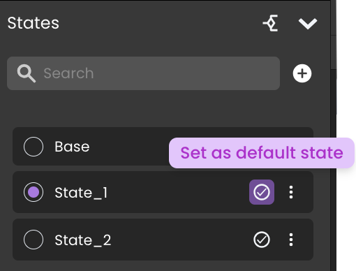
You can apply multiple states to a single Page. This allows for dynamic and conditional displays based on user interactions or other conditions.
Base State vs. Default State
The Base State contains all components and configurations that the Page could possibly display. In contrast, the Default State might hide certain components that should only appear under specific conditions. This strategy follows Qodly's best practices by keeping the Base State comprehensive and using the Default State for initial, conditional displays.
If there are components that should not be visible until certain conditions are met, setting a different state as the default instead of the base state can help in tailoring the initial user experience.
Event and Function Handling
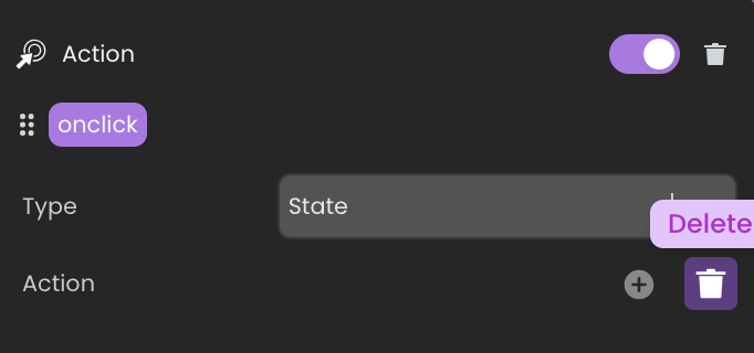
Standard Actions
Standard actions in Page states are integral to defining the Page’s behavior in response to user interactions:
- Add Action: Utilized for incorporating modifications from selected states into the base state.
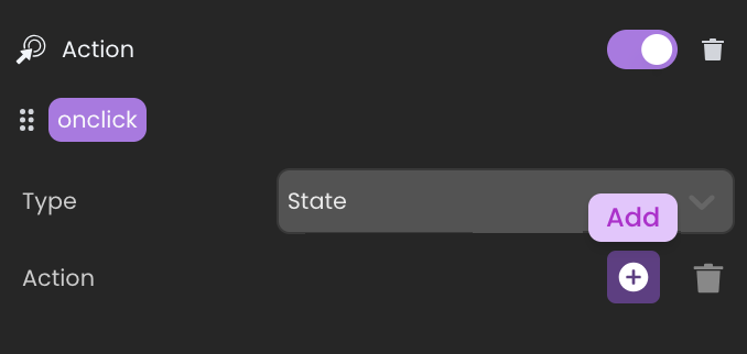
- Delete Action: This action facilitates the removal of selected states, along with their changes, in relation to the base state.
When a new state is applied or removed as a user interacts with an input field, the interaction remains uninterrupted ensuring that the focus on the input field is not lost by the state change.

The Base state and Conditional states, however, are not included among these selectable options. Only Non-Conditional states are included.
The states are enabled in the given order of the standard action (same if WebForm.enableState is called several times with different states).
If a state is initially "Non-Conditional" but later transitions to a "Conditional" state, any standard actions previously applied to this state will be removed.
Page Object Functions
In addition to the standard actions, Page object exposes several states related functions with error handling for "Conditional" states, like:
WebForm.enableState: Applies the differences from selected states to the current Page.WebForm.disableState: Removes the applied differences from the Page.
These functions are designed to target only "Non-Conditional" states. In the event a "Conditional" state is used, the function will either return an error or not execute any action.
Event Handling
The onLoad event triggers when the Page initially loads. However, it's designed not to re-trigger with subsequent state applications because:
Performance: Preventing re-triggering maintains Page responsiveness and avoids unnecessary processing.
State Integrity: This ensures modifications due to state changes don’t reset the Page’s initial setup.
Conflict Resolution
When a Page has multiple states applied, the most recently applied state will take priority in the event of any conflicts. This approach is essential to ensure that the Page accurately reflects the most up-to-date modifications.
Preview and Rendering
During state editing, the Preview in Studio button allows developers to see real-time changes, offering an immediate glimpse of how state modifications impact the Page. However, when it comes to Rendering, it defaults to displaying the base state.
To prevent any confusion between the editable and base states, the Preview button is disabled while editing states  .
.
Remember that when previewing in the studio, you are on the WebAdmin port, so no privilege restrictions are applied (even if you have Conditional states that reference privileges).