Settings
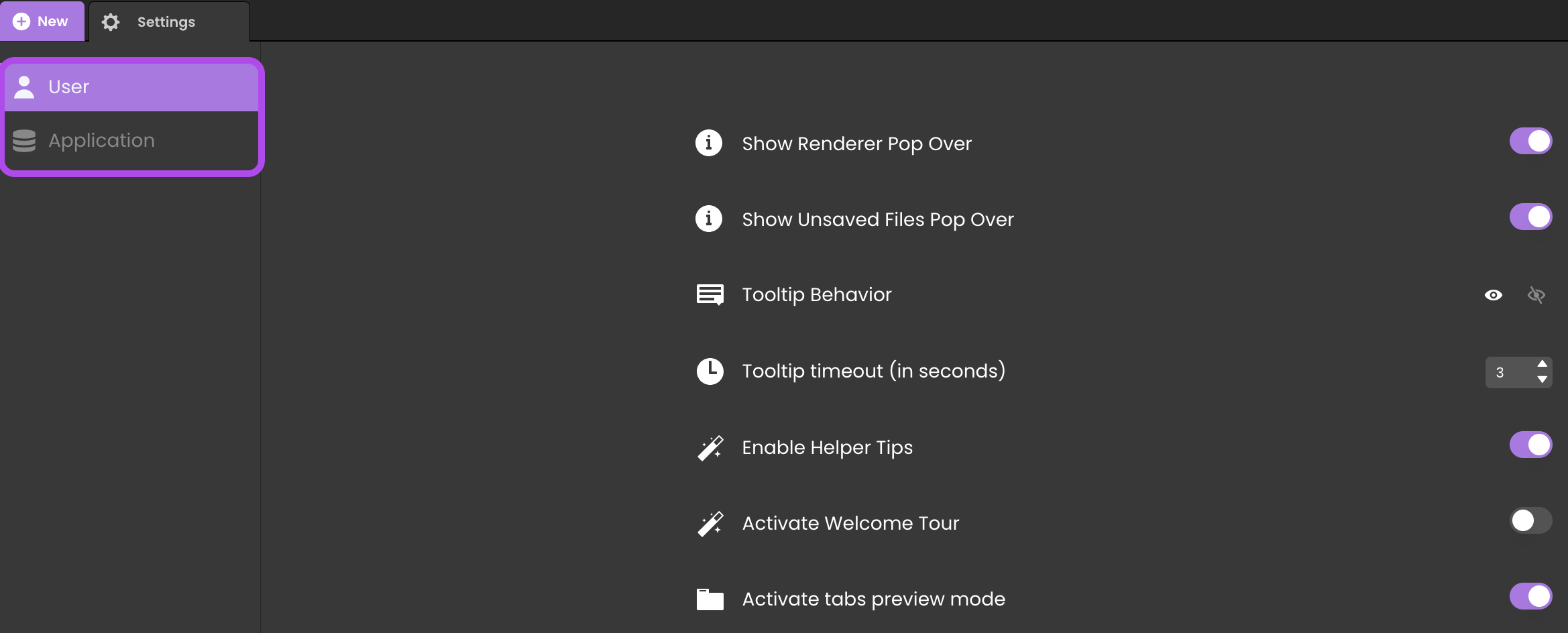
The Settings panel allows you to customize Qodly Studio interface for the current user and the current application.
To open the Settings panel, click on the Settings button from the Explorer or the toolbar:
The panel includes two main sections:
- User Settings: Interface customizations.
- Application Settings: Application configurations.
Navigate by selecting labels in the top left area of the panel:

User Settings
Adjustments for Qodly Studio's user interface.
Show Renderer Pop Over
Toggle the pop-up for different URL schemes in the renderer and Qodly Studio.
Show Unsaved Files Pop Over
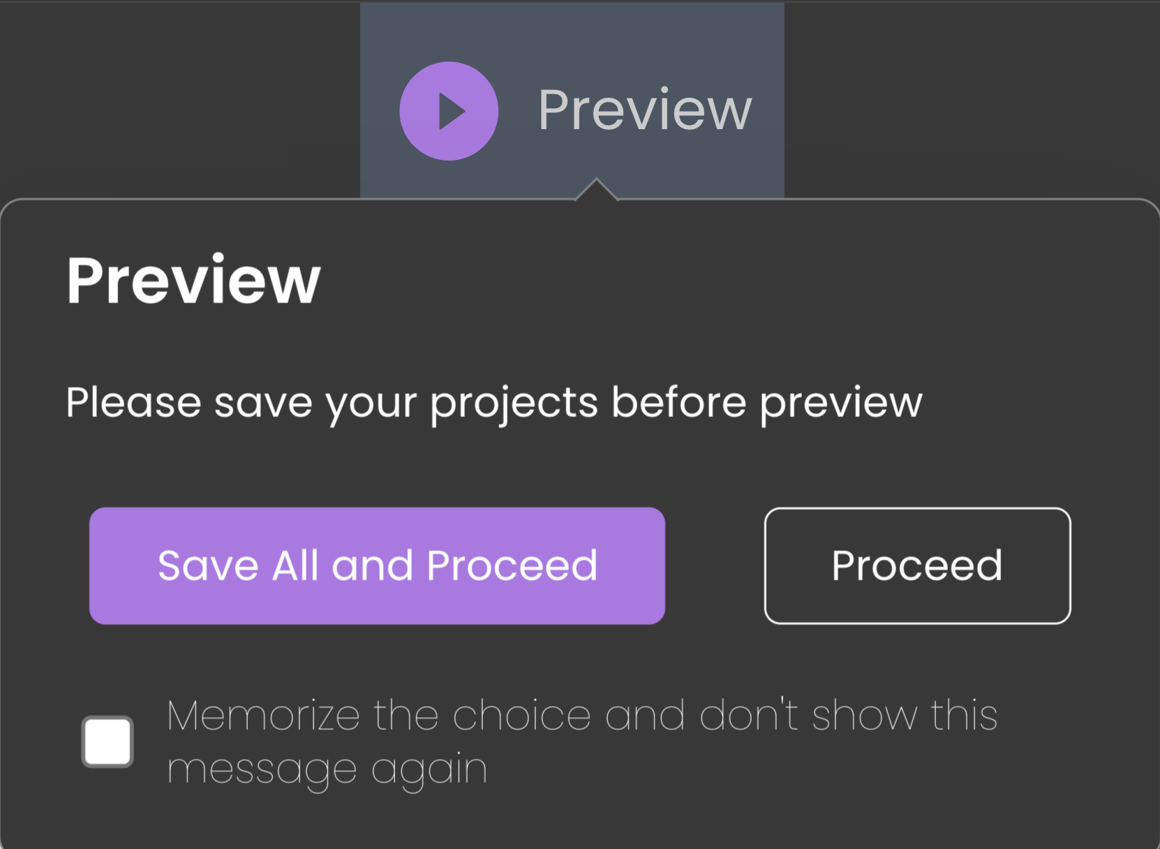
Toggle the warning pop-up for unsaved Page changes when rendering, when you click on the Preview button.

Tooltip Behavior
Set tooltip display on component hover . Options include show/hide after a timeout.
- Show after timeout: The tooltip appears following a specified delay and remains visible until the mouse is moved.
- Hide after timeout: The tooltip shows up instantly and then disappears after the set duration.
Tooltip timeout (in seconds)
Duration before the tooltip behavior activates, in seconds.
Enable Helper Tips
Show/hide helper tip icons in the Page Editor.
Activate Welcome Tour
Turn on/off the Welcome tour dialogs for Qodly Studio.
Activate tabs preview mode
Enables or disables the Tabs preview mode, which allows you to open and preview your Qodly files (Pages, model, classes, methods, or any other file) in a single tab. As a result, this option can reduce drastically the number of opened tabs in your project.
Application Settings
Configure settings specific to your web application.

Start Page
Enables selection of a Page to serve as the application’s start page. This chosen Page will automatically render in the following situations:
- When the Preview button is clicked in the Page Editor, the Page opens in a new tab.
- When the Authenticated URL area in the Qodly Cloud console is clicked, the Page is displayed.
Default Display Mode
Choose the default mode for displaying components in Pages:
- Neutral (default): No extra margins.
- Airy: Adds default margins for enhanced design.
The Airy mode can also be selected at the Page level.