Non-Conditional States
States Management
Creating a New State
To create a new state, one must click the button in the states section.
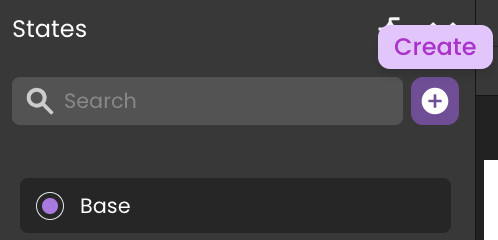
This action triggers the creation dialog, involving the assignment of a distinctive name to the state.
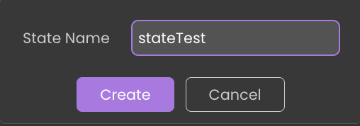
Upon creation, the new state becomes visible in the states section and automatically opens in the canvas, ready for modifications.
The selected state is highlighted with a checked box in the states list.
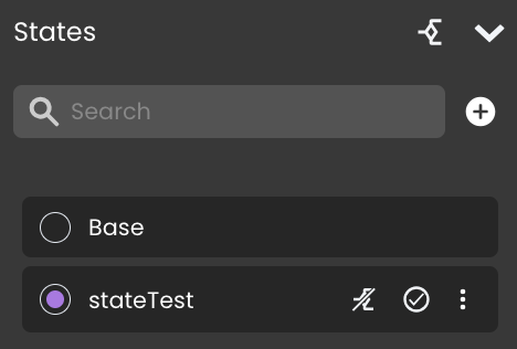
There is no restriction on the number of states that can be associated with a single Page.
Editing a State
Start editing a state by selecting it from the states panel, which then opens it on the canvas for customization. Notably, the Editing stateName tag will appear at the far right of the Contextual panel's header, indicating the current state under modification.
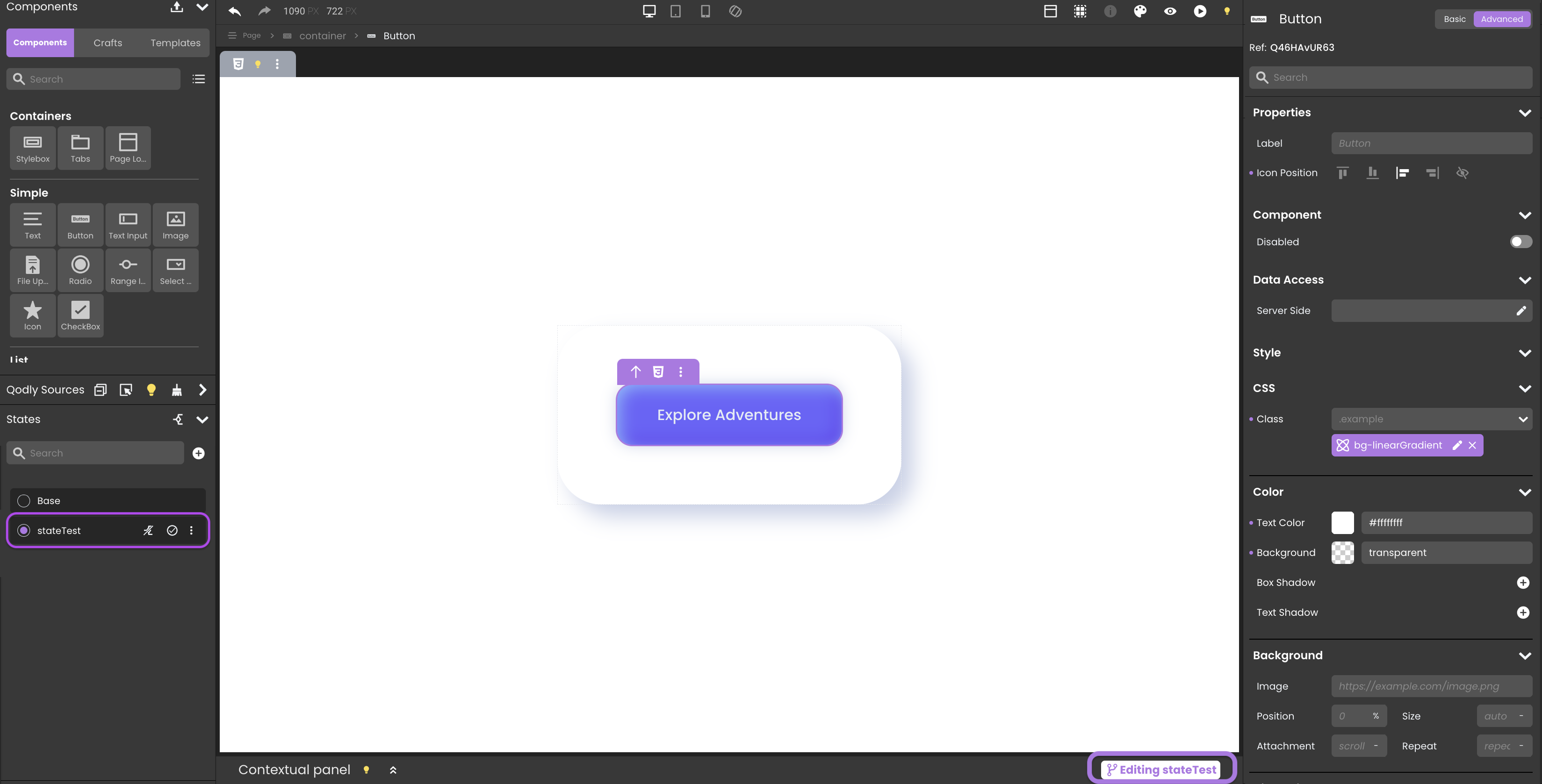
The editing process involves:
-
CSS Class Editing: Alter CSS classes linked to components.
tipClearing styles is allowed on states because modifying styles is permitted.
-
Component Visibility: Dynamically display or hide components.
infoAdding or deleting components is not allowed. This limitation is reflected by disabling specific keyboard shortcuts like remove, cut, paste into, clear content, duplicate, and clear styles.
-
Component Properties: Adjust component properties with limitations to ensure state integrity. All styling properties (e.g., color, font) can also be modified.
infoTo maintain state integrity, the "Data Access" category within component properties is deactivated during state editing.
-
Contextual Panel Update: The panel reflects the current state being edited, providing relevant information and limitations.
infoInitially, the contextual panel notes that
You can only view/modify CSS classes when editing a state. -
Airy Mode: Enable or disable airy mode settings for specific states.
-
Qodly Source Restrictions: On a state, no qodlysources can be dragged and dropped on components on the canvas.
Removing a State
To remove a state, click on the button located adjacent to the state's name within the states panel.
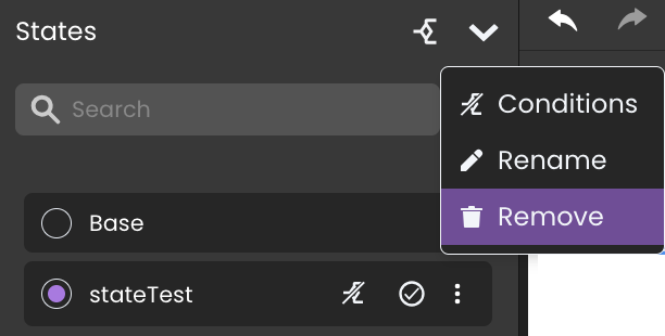
Upon initiating deletion, a confirmation popup will appear, requiring user confirmation to proceed.
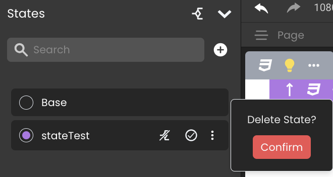
Once a state is successfully deleted, it is automatically disassociated from any related standard actions it was previously involved in. This includes the removal of the state's tag from the states field.
Renaming a State
To rename a state, click on the button located adjacent to the state's name within the states panel.
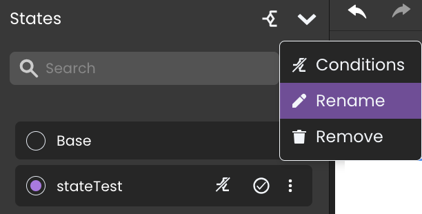
Upon initiating renaming, the state name switches to an editable input field.
All references to the state in the events are automatically updated post-renaming, preserving the Page’s functional integrity.
Resetting State Changes
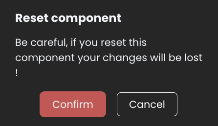
The Reset button allows users to revert any changes made to a component back to its original settings from the Base state.
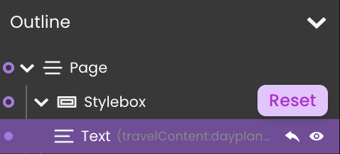
Steps to Reset a Component:
- Locate the Component: Find the component in the Page outline.
- Click the Reset Button: This button appears as a circular arrow icon next to the component.
- Confirm Reset: When prompted, confirm the action to ensure changes are reverted.
Event and Function Handling
Standard Actions
Standard actions in Page states are integral to defining the Page’s behavior in response to user interactions:
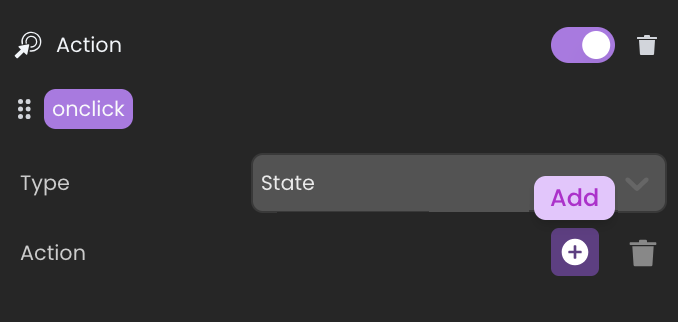
- Add Action: Utilized for incorporating modifications from selected states into the base state.
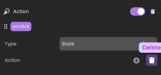
- Delete Action: This action facilitates the removal of selected states, along with their changes, in relation to the base state.
When a new state is applied or removed as a user interacts with an input field, the interaction remains uninterrupted ensuring that the focus on the input field is not lost by the state change.
When triggering these actions, users can select from available states, which are then tagged in the state field.

The Base state and Conditional states, however, are not included among these selectable options. Only Non-Conditional states are included.
The states are enabled in the given order of the standard action (same if WebForm.enableState is called several times with different states).
If a state is initially "Non-Conditional" but later transitions to a "Conditional" state, any standard actions previously applied to this state will be removed.
Page Object Functions
In addition to the standard actions, Page object exposes several states related functions with error handling for "Conditional" states, like:
WebForm.enableState: Applies the differences from selected states to the current Page.WebForm.disableState: Removes the applied differences from the Page.
These functions are designed to target only "Non-Conditional" states. In the event a "Conditional" state is used, the function will either return an error or not execute any action.
Event Handling
The onLoad event triggers when the Page initially loads. However, it's designed not to re-trigger with subsequent state applications because:
-
Performance: Preventing re-triggering maintains Page responsiveness and avoids unnecessary processing.
-
State Integrity: This ensures modifications due to state changes don’t reset the Page’s initial setup.
Preview and Rendering
During state editing, the Preview in Studio button allows developers to see real-time changes, offering an immediate glimpse of how state modifications impact the Page. However, when it comes to Rendering, it defaults to displaying the base state.
To prevent any confusion between the editable and base states, the Preview button is disabled while editing states  .
.
Remember that when previewing in Qodly Studio, you are on the WebAdmin port, so no privilege restrictions are applied (even if you have Conditional states that reference privileges).