Text Input
The Text Input component is an interactive UI element that enables user interactions by allowing the input of alphanumeric data within a Page. With support for various input types, this component accommodates diverse data entry scenarios.
The Text Input component contains an embedded Input and a Label element. This is of great importance as configuring the Text Input component may require adjusting properties within the embedded elements. This applies to the visual style, triggers, and actions as they may differ.
Use Cases
The Text Input component provides a versatile solution for a wide range of scenarios:
-
User Profile Management: Users can update their personal information, such as names, contact details, and addresses, ensuring accurate and up-to-date records.
-
Data Filtering: Users can input search criteria, making it easier to locate specific records within large datasets.
-
Comments and Notes: Employees can leave comments, feedback, or additional information on records, facilitating efficient communication and collaboration.
Properties Customization
Text Input Component
Enhance the Text Input component to align with your application's requirements using the following customization options:
- Label Position: Developers can tailor the label's position, placing it above, below, to the left, to the right, or even hidden.
Embedded Label
Within the Text Input component, an embedded Label allows for further customization of the following properties:
- Label: Personalize the label to offer clear instructions or guidance.
Embedded Input
Within the Text Input component, an embedded Input allows for further customization of the following properties:
- Placeholder: Set a placeholder to provide users with a hint or example of the expected input. This text appears within the input field and disappears as soon as users begin typing.
- Input Type: Select the appropriate input type to match the nature of the expected data. Available types include:

- text: Standard alphanumeric data.
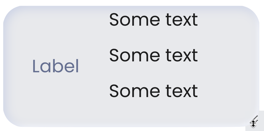
- text area: Larger text area for expanding and adjusting size.
- number: Numerical values only.
- password: Concealed input for sensitive data.
- date: Limits input to date values with a date picker.
- You can define date intervals manually using the "Add Interval" button.
- Alternatively, you can bind an external datasource (structured as a collection of objects with specific properties defining the filtering rules) to dynamically fetch intervals.
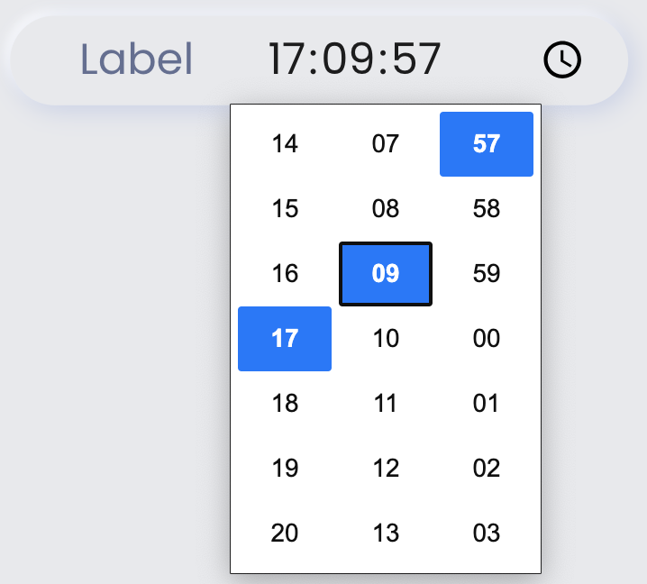
- time: Limits input to time values with a widget for selection, allowing scrolling or clicking to choose values
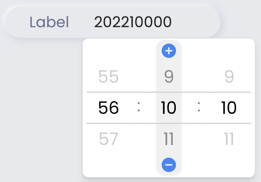
- duration: Limits input to duration values with a widget, enabling scrolling, manual entry, or using the + and - icons.



For Text Input components of type password, when the "Reveal Password" toggle is enabled:

The eye icon and tooltip functionality are displayed by default.


However, when the "Reveal Password" toggle is disabled, the password remains hidden, and the tooltip functionality is not available.
You can adjust the placement of the reveal password icon within the text input field. Choose between left or right positioning based on your design preferences or functional needs.
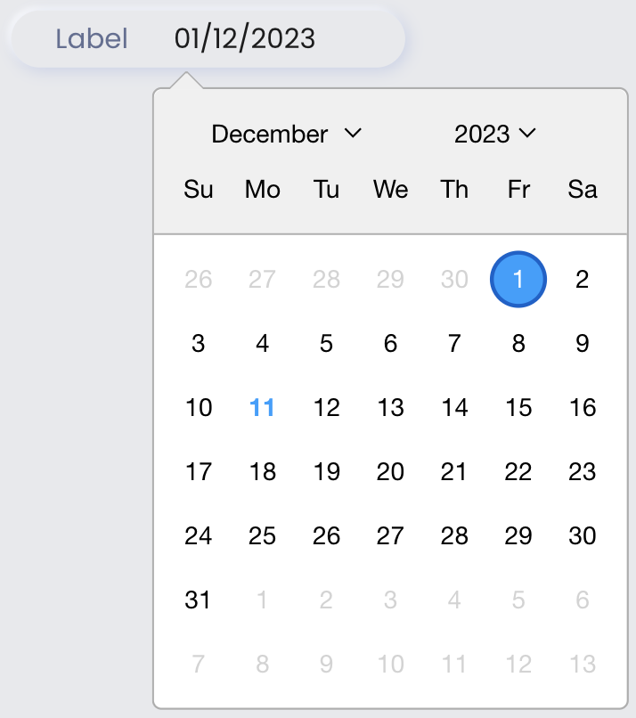
Week Starts  defines which day should be considered the start of the week in the date picker. You can select a starting day such as Monday, Sunday, or any other day depending on your region or application needs.
The Intervals feature allows users to control date selection by either linking a datasource or manually defining intervals:
| Interval Type | Description | Available Options |
|---|---|---|
| Starting from | Defines a start date from which users can select dates onward. | - Today checkbox: sets the start date as today - From: calendar picker to select a start date |
| Until | Restricts date selection up to a specific date. | - Today checkbox: sets the end date as today - To: calendar picker to select an end date |
| Range | Specifies a date range with a start and end date, and can be set to repeat (e.g., Weekly). | - From: start date - To: end date - Repeat: Weekly, Monthly, Yearly |
| Days | Limits selection to specific days of the week, such as Monday, Tuesday, Wednesday. | - Days selection dropdown: allows choosing specific days of the week: Monday, Tuesday, etc. |
Interval Datasource Schema
| Property | Type | Description |
|---|---|---|
include | Boolean | Defines whether the interval should include (true) or exclude (false) dates. |
type | String | Specifies the interval type. Possible values: startingFrom, until, range, days. |
params | Object | Contains details about the interval, such as specific dates or recurring patterns. |
params Object Properties
| Interval Type | Parameters | Example JSON Format |
|---|---|---|
| Starting From | - from (String): Start date. - toDay (Boolean): Uses today's date if true. | [{ "include": true, "type": "startingfrom", "params": { "from": "2025-02-08" } }] [{ "include": true, "type": "startingfrom", "params": { "toDay": true } }] |
| Until | - to (String): End date. - toDay (Boolean): Uses today’s date if true. | [{ "include": true, "type": "untilto", "params": { "to": "2025-02-08" } }] [{ "include": true, "type": "untilto", "params": { "toDay": true } }] |
| Range | - from (String): Start date. - to (String): End date. - repeat (String): Optional (weekly, monthly, yearly). | [{ "include": true, "type": "range", "params": { "from": "2025-02-08", "to": "2025-02-28", "repeat": "monthly" } }] [{ "include": true, "type": "range", "params": { "from": "2025-02-08", "to": "2025-02-28" } }] |
| Days | - days (Array): Defines allowed weekdays. | [{ "include": true, "type": "days", "params": { "days": [ { "label": "Monday", "value": "monday" } ] } }] |
Once an interval datasource is added, manual interval addition is disabled. To re-enable manual intervals, remove the datasource first.
- Input Format: Specify the desired format for the entered data.
See Formats for a description of available formats.
Data Integration
The Text Input component allows for seamless integration of Qodly Sources, enabling dynamic data binding and interaction within the Page.
The qodlysource for the Text Input component should be of type text, number, date, or duration.
Data Binding
To associate data with the Text Input component, follow these steps:
- Navigate to the Properties Panel: Access the Data Access category located within the Properties panel for the Text Input component.
- Define the Qodly Source: Specify the appropriate qodlysource that contains the data you want to display within the Text Input or retrieve from user input. This can be an attribute from an entity, an array, or a direct qodlysource of type text. For instance, you can select an entity, such as
package.
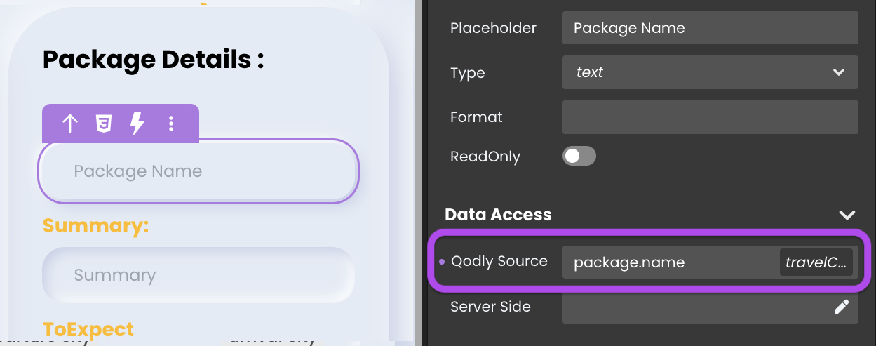
- Choose the Attribute: Choose the specific attribute that you want to display within the component when using an entity or an array type qodlysource, such as
package.name.
Alternatively, you can establish the connection by dragging and dropping the qodlysource onto the Text Input component.
Server-Side Interaction
Retrieving user input data is equally effortless. By binding a Qodly Source to the Text Input component, you can access and employ user-entered content.
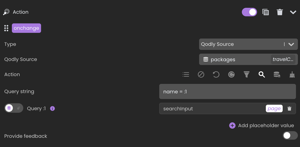
Imagine a search input where users type to find packages. Binding a qodlysource captures the input.

Consequently, you can utilize this input value in various ways, such as within a standard action to initiate a search with matching attribute values.
Customizing Text Input Styles
The Text Input component consists of embedded elements that can be styled individually to enhance appearance and usability. Below are customization details for the HTML tags and HTML attributes used in this component.
Component-Specific Tags
The following HTML tags make up the structure of the Text Input component. Each tag can be individually styled to adjust its appearance and interaction.
| Tag Name | Applies To | Description |
|---|---|---|
<label> | Container for the text label | This wraps the label text for the input field. Customizing the label with CSS can change its font size, color, and spacing, affecting its visibility and alignment relative to the input. |
<span> | Label text inside <label> | Displays the actual label text. CSS changes to the span can modify text color, style, or opacity, influencing the label’s emphasis and readability. |
<input> | Field for user text entry | The primary element where users enter data. Styling the input affects border, background, padding, and focus state, impacting its overall look, spacing, and user interaction feedback. |
Component-Specific Attributes
HTML attributes within the Text Input component provide additional customization options, particularly for guiding user interactions.
| Attribute Name | Applies To | Description |
|---|---|---|
placeholder | Input field | Provides hint text within the input field when it is empty. Styling the placeholder can change its color, font style, and opacity, offering subtle guidance to users on what to enter. |
Example 1 - Overall Component Style
The self selector targets the entire Text Input component, allowing you to customize its size, font, and shadow effects.
/* Input tag styling*/
self input{
  width: 20.4rem;
  height: 4rem;
  border-radius: 1rem;
  font-size: 1.4rem;
  box-shadow: inset .2rem .2rem .5rem #c8d0e7, inset -.2rem -.2rem .5rem #FFFFFF;
  background: none;
  font-family: inherit;
  color: #9a8ff8;
  border: 0 !important;
}
/* Layout adjustment to display the first child element as a flex container */
self > :first-child{
  display: flex;
}
Example 2 - Placeholder Style
The self input::placeholder selector targets the placeholder text, giving it a distinct color for clarity.
/* Placeholder text color */
self input::placeholder{
  color: #a3a9b5;
}
Example 3 - Focus Style
The self:focus-within selector applies when the input is focused, such as when a user clicks or types in the field, adding a visual effect to indicate that the field is active.
/* Focus state styling for the input tag */
self input:focus-within {
  outline: none;
  box-shadow: .3rem .3rem .6rem #c8d0e7, -.2rem -.2rem .5rem #FFFFFF;
  color: #6d5dfc;
}
Example 4 - Label as a Search Icon Inside the Text Input Field
In this example, the Text Input component’s label is positioned on the left and is visible. The self label::before selector is used to replace the label with a search icon, and self:focus-within label::before changes the icon’s color when the input is focused.
Make sure that the label text is empty so that you won’t have an icon next to the text label you put.
/* Main component styling*/
self {
  width: 20.4rem;
  height: 4rem;
  border-radius: 1rem;
  font-size: 1.4rem;
  box-shadow: inset .2rem .2rem .5rem #c8d0e7, inset -.2rem -.2rem .5rem #FFFFFF;
  background: none;
  font-family: inherit;
  padding-left: 1.4rem;
}
/* Input tag styling*/
self input{
  color: #9a8ff8;
  border: 0 !important;
}
/* Layout adjustment to display the first child element as a flex container */
self > :first-child{
  display: flex;
}
/* Placeholder text color */
self input::placeholder{
  color: #a3a9b5;
}
/* Focus state styling for the main component */
self:focus-within {
  outline: none;
  box-shadow: .3rem .3rem .6rem #c8d0e7, -.2rem -.2rem .5rem #FFFFFF;
}
/* Focus state styling for input text color */
self input:focus-within {
  color: #6d5dfc;
}
/* Adds an icon before the label text */
self label::before{
  content: "002";
  font: normal normal normal 14px/1 FontAwesome;
  font-size: x-large;
  color: #9baacf;
}
/* Changes the search icon color when the input is in focus */
self:focus-within label::before{
  color: #6d5dfc;
}
Triggers and Events
Text Input Component
The Text Input component can respond to various events, enabling dynamic user experiences. Events that can trigger actions within the component include:
| Event | Description |
|---|---|
| On Click | Calls for an action when the user clicks on the component. |
| On MouseEnter | Calls for an action when the user's mouse cursor enters the area of the component. |
| On MouseLeave | Calls for an action when the user's mouse cursor exits the area of the component. |
Embedded Input
The embedded Input can also respond to various events, allowing for dynamic user experiences. Events that can trigger actions within the embedded icon include:
| Event | Description |
|---|---|
| On Change | Calls for an action when the value of the Input changes. This typically occurs when the user enters or modifies text in the Input field. |
| On Click | Calls for an action when the user clicks on the Input. |
| On Keyup | Calls for an action when a keyboard key is released while the Input is in focus |
| On KeyDown | Calls for an action when a keyboard key is pressed down while the Input is in focus. |
| On AuxClick | Calls for an action when the user performs an auxiliary action (e.g., right-click or middle-click) on the Input. |
| On Blur | Calls for an action when the Input loses focus (user clicks outside). |
| On Focus | Calls for an action when the Input gains focus (user clicks on it). |
| On MouseEnter | Calls for an action when the user's mouse cursor enters the area of the Input. |
| On MouseLeave | Calls for an action when the user's mouse cursor exits the area of the Input. |
Embedded Label
The embedded Label can also respond to various events, allowing for dynamic user experiences. Events that can trigger actions within the embedded icon include:
| Event | Description |
|---|---|
| On Click | Calls for an action when the user clicks on the Label. |
| On Keyup | Calls for an action when a keyboard key is released while the Label is in focus |
| On KeyDown | Calls for an action when a keyboard key is pressed down while the Label is in focus. |
| On MouseEnter | Calls for an action when the user's mouse cursor enters the area of the Label. |
| On MouseLeave | Calls for an action when the user's mouse cursor exits the area of the Label. |