Image
The Image component is a UI element that enables you to integrate images into your Page.
Use Cases
The Image component offers versatile solutions for enhancing your web application's visual experience:
- Static Images: Display fixed visual elements, such as logos, icons, and decorative images.
- Dynamic Content: Display dynamic content fetched from qodlysources.
- Data Visualization: Display charts, graphs, and diagrams as images, enabling the visualization of complex data in a more accessible and engaging manner.
Display Options
The Image component offers multiple options for displaying images.
Qodly Source Binding
You can bind the Image component to a qodlysource of type image, causing the displayed image to update according to the value within the qodlysource.
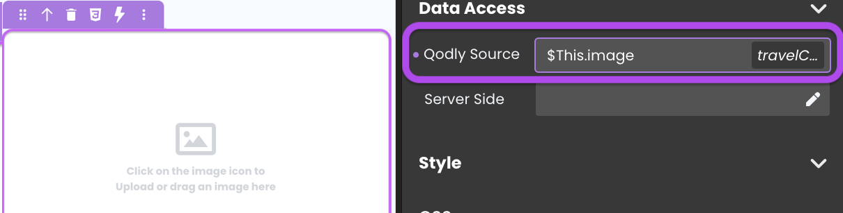
Image Source
Alternatively, you can specify an image source directly. This source can be a URL or a path to the image stored in the Shared folder.

For instance, if you've uploaded an image named "booking.png" in a "visuals" folder, you can set the image source as /$shared/visuals/booking.png.
Image Management
Direct Image Upload
The Image component simplifies the process of adding new images. By clicking on the image component and uploading the desired picture, the image is automatically added to the Shared folder's /$shared/assets/images subdirectory. The component's image source is updated accordingly.
Alternatively, you can establish the connection by dragging and dropping an image qodlysource onto the Page, which will automatically add an Image component with the qodlysource bound to it.
Default Image Source
Qodly displays a "missing image" placeholder in the Image component when the bound image qodlysource is null, such as when the "photo" attribute of an "Employee" entity has not been uploaded:
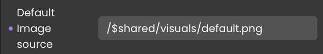
Use the Default Image Source property to define your own default image, allowing you to replace the standard placeholder with a custom image that fits your application's aesthetics or branding:

Drag and Drop from Shared Folder
The Image component supports a drag and drop functionality that allows users to move images directly from a shared folder to become the image source. This feature is particularly useful for rapidly updating the image souce without the need for navigating through files.
Triggers and Events
The Image component can respond to various events, enabling dynamic user experiences. Events that can trigger actions within the component include:
| Event | Description |
|---|---|
| On Click | Calls for an action when the user clicks on the component. |
| On MouseEnter | Calls for an action when the user's mouse cursor enters the area of the component. |
| On MouseLeave | Calls for an action when the user's mouse cursor exits the area of the component. |