Button
The Button component is a UI element that prompts user engagement and triggers actions within your Page.
The Button component has an Icon element embedded within it. This is of great importance as configuring the Button component may require adjusting properties within the embedded element. This applies to the visual style, triggers, and actions as they may differ.
Use Cases
Buttons are indispensable in a wide range of scenarios where user engagement and interaction are paramount:
-
Form Submission: Utilize buttons to allow users to submit forms after providing necessary input.
-
Navigation: Implement buttons to facilitate navigation between different sections or pages of your application.
-
Data Manipulation: Enable users to perform operations such as adding, editing, or deleting data entries through buttons.
Properties Customization
Button Component
Enhance the Button component to align with your application's requirements using the following customization options:
- Label: Personalize the label to offer clear instructions or guidance.
- Icon Position: Choose the position of the icon in relation to the label, allowing options for top, bottom, left, right, or even hidden for a seamless integration into your design.

Embedded Icon
Within the Button component, an embedded Icon allows for further customization of the following properties:
- Icon: When the icon visibility is configured in the Button component's customization properties, you can select an icon from an icon picker list.
Data Integration
When it comes to data-binding, it's important to note that the Button component itself is not inherently data-bound. Unlike components like the DataTable that derive their content from specified Qodly Sources, the Button component primarily focuses on initiating actions and interactions within the user interface.
Customizing Button Styles
Example 1 - Overall Component Style
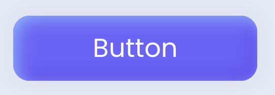
The self selector targets the entire Button component, allowing you to customize its size, shape, and appearance with background color and shadows.
/* Main component styling*/
self {
  width: 15rem;
  height: 4rem;
  border-radius: 1rem;
  cursor: pointer;
  background: #6d5dfc;
  box-shadow:inset .2rem .2rem 1rem #8abdff, inset -.2rem -.2rem 1rem #5b0eeb, 0rem 0rem 1rem #c8d0e7, 0rem 0rem 0.5rem #FFFFFF;
}
Example 2 - Active Button Style
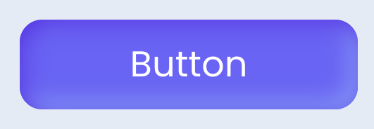
The self:active selector applies when the button is actively pressed or clicked, providing visual feedback with a change in shadow effect to simulate a "pressed-in" appearance.
/* Button active (pressed) styling */
self:active{
  box-shadow:inset .2rem .2rem 1rem #5b0eeb, inset -.2rem -.2rem 1rem #8abdff;
}
Triggers and Events
Button Component
The Button component can respond to various events, enabling dynamic user experiences. Events that can trigger actions within the component include:
| Event | Description |
|---|---|
| On Click | Calls for an action when the user clicks on the component. |
| On Blur | Calls for an action when the component loses focus (user clicks outside). |
| On Focus | Calls for an action when the component gains focus (user clicks on it). |
| On MouseEnter | Calls for an action when the user's mouse cursor enters the area of the component. |
| On MouseLeave | Calls for an action when the user's mouse cursor exits the area of the component. |
| On Keyup | Calls for an action when a keyboard key is released while the component is in focus |
| On KeyDown | Calls for an action when a keyboard key is pressed down while the component is in focus. |
Embedded Icon
The embedded Icon can also respond to various events, allowing for dynamic user experiences. Events that can trigger actions within the embedded icon include:
| Event | Description |
|---|---|
| On Click | Calls for an action when the user clicks on the Icon. |
| On Keyup | Calls for an action when a keyboard key is released while the Icon is in focus |
| On KeyDown | Calls for an action when a keyboard key is pressed down while the Icon is in focus. |
| On MouseEnter | Calls for an action when the user's mouse cursor enters the area of the Icon. |
| On MouseLeave | Calls for an action when the user's mouse cursor exits the area of the Icon. |