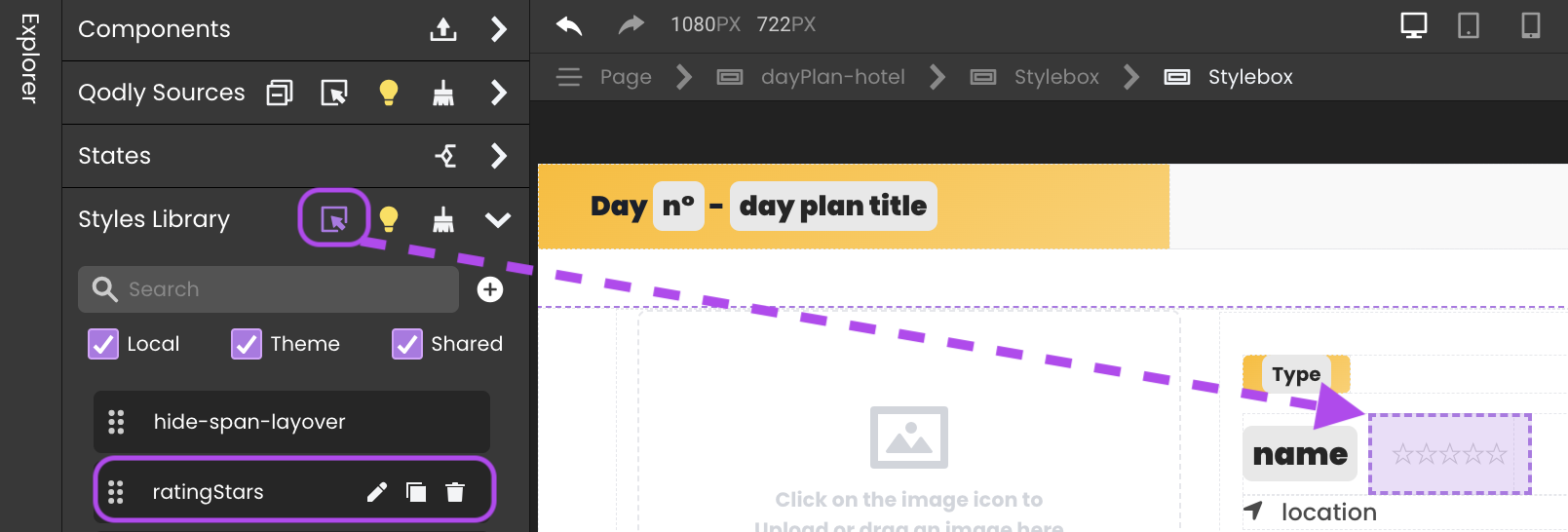
Styles Library
After placing a component on the Canvas, you have the freedom to tailor its appearance using a variety of styling tools.
Overview
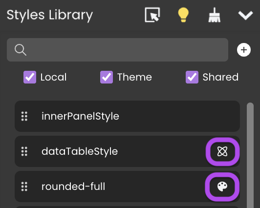
The Styles Library provides a powerful way to style your components. You can do this by simply dragging CSS classes from the Styles Library and dropping them onto the components.
The Styles Library provides three distinct types of CSS classes:
- Local: These CSS classes are specific to the Pages in which they are created and do not have an icon next to them.
- Theme: Predefined CSS classes designed for standard themes, which can be applied across all Pages in your application. You can recognize them by this icon
 .
. - Shared: CSS classes that are shareable and can be used across all Pages within your application. These are identifiable by this unique icon
 .
.
Properties Panel Styling Options
Below is a comprehensive table that consolidates all styling options from the properties panel.
| Category | Property | Definition | Types |
|---|---|---|---|
| CSS | Class | Specifies the CSS class applied to an element. | User-defined class names (Typed manually or selected from a list) |
| Color | Text Color | Defines the color of the text. | Any RGB/HEX value (Can be manually entered or selected from a color panel) |
| Background | Specifies the element’s background color. | Any RGB/HEX value (Typed manually or selected from a color panel) | |
| Box Shadow | Adds shadow effects to the element’s box. | Configurable properties: - Angle: Sets the direction of the shadow (0-360°) - Distance: Determines how far the shadow moves (PX) - Blur: Controls the sharpness of the shadow (PX) - Size: Adjusts the spread of the shadow (PX) - Color: Defines the shadow color (RGB/HEX) | |
| Text Shadow | Adds shadow effects to the text. | Configurable properties: - Angle: Sets the direction of the shadow (0-360°) - Distance: Determines how far the shadow moves (PX) - Blur: Controls the sharpness of the shadow (PX) - Color: Defines the shadow color (RGB/HEX) | |
| Background | Image | Sets a background image. | URL input |
| Position | Defines how the image is positioned within the element. | - Percentage-based: Specifies the position as a percentage of the element’s width/height (e.g., 0%, 50%) - Center: Centers the image horizontally and vertically | |
| Attachment | Determines if the background image scrolls with the page. | - Scroll: The background moves when scrolling - Fixed: The background remains fixed in place while content scrolls - Local: The background scrolls only within the element it is applied to - Initial: Resets to the default browser-defined behavior - Inherit: Inherits the attachment setting from the parent element | |
| Size | Defines how the background image is scaled. | - Cover: Resizes the image to fully cover the container, potentially cropping parts of it - Contain: Resizes the image to fit within the container without cropping - PX: Allows manual pixel-based scaling - %: Scales the image relative to the container size | |
| Repeat | Defines how the background image repeats. | - No-repeat: Displays the image once without repetition - Repeat: Tiles the image both horizontally and vertically - Repeat-x: Repeats the image only horizontally - Repeat-y: Repeats the image only vertically - Space: Tiles the image with even spacing between repetitions - Round: Stretches the image slightly to ensure full coverage | |
| Dimensions | Width | Specifies the width of the element. | Customizable using PX, EM, REM, VW, VH, PT, %, AUTO, NONE, UNSET, INHERIT |
| Height | Specifies the height of the element. | Customizable using PX, EM, REM, VW, VH, PT, %, AUTO, NONE, UNSET, INHERIT | |
| Min Width | Sets the minimum width. | Customizable using PX, EM, REM, VW, VH, PT, %, AUTO, NONE, UNSET, INHERIT | |
| Min Height | Sets the minimum height. | Customizable using PX, EM, REM, VW, VH, PT, %, AUTO, NONE, UNSET, INHERIT | |
| Max Width | Sets the maximum width. | Customizable using PX, EM, REM, VW, VH, PT, %, AUTO, NONE, UNSET, INHERIT | |
| Max Height | Sets the maximum height. | Customizable using PX, EM, REM, VW, VH, PT, %, AUTO, NONE, UNSET, INHERIT | |
| Layout | Margin | Defines the space outside the element. | Customizable using PX, EM, REM, VW, VH, PT, %, AUTO, NONE, UNSET, INHERIT |
| Padding | Defines the space inside the element, between content and border. | Customizable using PX, EM, REM, VW, VH, PT, %, AUTO, NONE, UNSET, INHERIT | |
| Appearance | Position | Defines how the element is positioned in the document flow. | - Static: Default positioning in normal document flow - Relative: Positioned relative to its original position - Absolute: Positioned relative to the nearest positioned ancestor - Fixed: Positioned relative to the viewport and doesn’t move when scrolling - Sticky: Switches between relative and fixed based on scroll position |
| Cursor | Specifies the cursor appearance when hovering over the element. | Various cursor options including Auto, Pointer, Not Allowed, Move, Text, Vertical Text, Progress, Help, Context Menu, Cell, Alias | |
| Overflow | Determines what happens when content overflows the element’s box. | - Auto: Scrollbars appear when necessary - Hidden: Content is clipped if it overflows - Scroll: Scrollbars are always present - Visible: Content overflows without restrictions | |
| Display | Controls the display behavior of the element. | - Block: The element takes up the full width of its parent - Flex: Enables flexible box layout - Inline: The element takes up only as much width as necessary - Inline-Block: Similar to inline but allows width and height properties - None: The element is removed from the document flow | |
| Z-Index | Controls the stack order of elements. | - Num: A numerical value where higher numbers place elements above lower numbers - Auto: The browser determines the stacking order based on document structure - Inherit: Inherits the z-index from the parent element | |
| Flex Settings (If Display is Flex) | |||
| Direction | Defines the direction of flexbox items. | - Row: Items are placed in a horizontal row (default) - Row Reverse: Items are placed in a horizontal row but in reverse order - Column: Items are stacked vertically - Column Reverse: Items are stacked vertically but in reverse order | |
| Gap | Defines spacing between flex items. | Customizable using PX, EM, REM, VW, VH, PT, %, AUTO, NONE, UNSET, INHERIT | |
| Justify | Aligns flex items along the main axis. | - Start: Items align at the start of the flex container - Center: Items align in the center - End: Items align at the end - Space-between: Items are evenly distributed with space between them - Space-around: Items are evenly distributed with space around them | |
| Align | Aligns flex items along the cross axis. | - Start: Items align at the start of the cross axis - Center: Items align in the center - End: Items align at the end - Stretch: Items stretch to fill the container - Baseline: Items align along their text baseline | |
| Wrap | Defines whether flex items should wrap to the next line. | - No Wrap: All flex items stay on one line - Wrap: Items wrap onto multiple lines | |
| Font | Family | Defines the font type used for text. | Various font options like Poppins, Open Sans, Sans-serif |
| Weight | Specifies the thickness of text. | Ranges from 100 (Thin) to 900 (Black) | |
| Size | Sets the size. | Customizable using PX, EM, REM, VW, VH, PT, %, AUTO, NONE, UNSET, INHERIT | |
| Align | Aligns text horizontally. | - Start: Aligns text to the left - Center: Centers text horizontally - End: Aligns text to the right - Justify: Spreads text evenly across the width | |
| Style | Applies text styles. | - Italic: Slants the text to the right - Underline: Draws a line beneath the text - Strikethrough: Draws a line through the middle of the text | |
| Transform | Modifies the text case. | - None: No transformation is applied - Uppercase: Converts all text to uppercase letters - Lowercase: Converts all text to lowercase letters - Capitalize: Capitalizes the first letter of each word | |
| Borders | Width | Specifies the thickness of the border. | Customizable using PX, EM, REM, VW, VH, PT, %, AUTO, NONE, UNSET, INHERIT |
| Color | Defines the border color. | Any RGB/HEX value (Typed manually or selected from the color panel) | |
| Style | Determines the border design. | None, Solid, Dashed, Dotted | |
| Border Radius | Size | Controls the rounding of the element’s corners. | Customizable using PX, EM, REM, VW, VH, PT, %, AUTO, NONE, UNSET, INHERIT |
- PX: Fixed width in pixels
- EM/REM: Relative to the font size
- VW/VH: Relative to viewport width/height
- PT: Measured in points (used in print media)
- %: Relative to the parent element
- AUTO: Adjusts width based on content
- NONE: No width restriction
- UNSET: Removes any previously applied width
- INHERIT: Inherits width from the parent element
- FIT-CONTENT: Shrinks or expands to fit content
CSS Classes Management
Adding a CSS Class
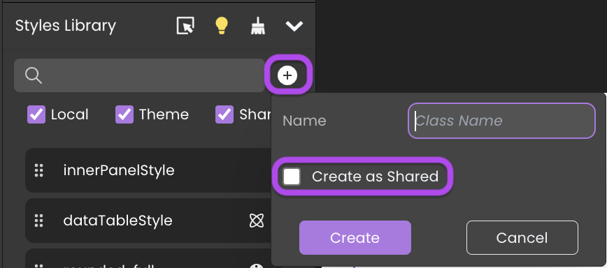
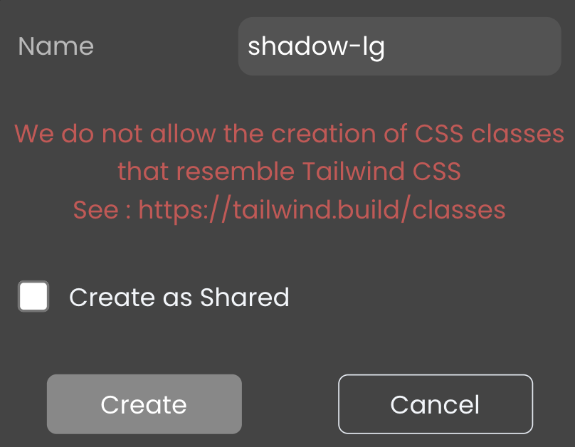
To add a CSS class, click the  button, give it a name, and then choose the appropriate type:
- For a local CSS class: Leave the "Create as Shared" option unchecked.
- For a shared CSS class: Check the "Create as Shared" option.
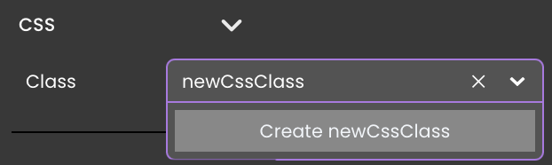
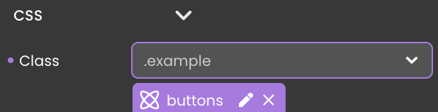
An alternative method to establish a new CSS class is through the properties panel, within the Style category. You can input your desired name, for example "newCssClass", into the CSS field.
If this name doesn't correspond to any existing CSS classes, you will be prompted with the option to create a new one.
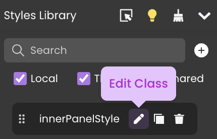
Editing a CSS Class
To edit a CSS class code, click the edit button  within the Styles Library next to the class's name. This action will open it in the contextual panel.
-
Both Local and Shared CSS class codes can be modified in the Contextual panel at the interface's bottom.
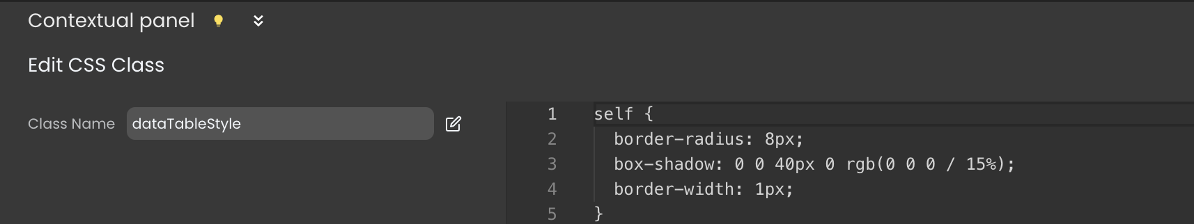
The changes will affect all the components utilizing this CSS class.
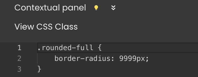
- Theme classes, however, are non-editable, they can only be viewed by clicking on the
 button next to their name in the Styles Library.
An alternative approach to edit a CSS class is to navigate to the Style category, where you can check which CSS classes affect your component and access them using the edit button  .
.
Renaming a CSS Class
Inside the Contextual panel, you'll find a field with the class name  and an edit button
  next to it. Click on it to rename the class.
Theme CSS classes cannot be renamed.
Deleting a CSS Class
To remove a CSS class, click the delete button  next to its name in the Styles Library.
Theme CSS classes cannot be deleted.
Removing Unused CSS Classes
An unused CSS class refers to any local class that is defined but not utilized in any section of the Page.
Click on the Delete Unused Elements button 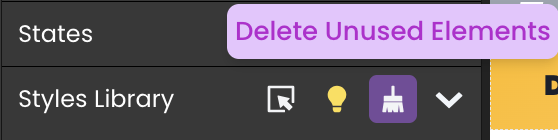 located in the Styles Library's header to cleanse your Page of unnecessary CSS classes.
Converting a Local CSS Class to Shared
Inside the Contextual panel, you'll find a field with the class name  and a share button
  next to it. Click on it to transform a local CSS class into a shared one.
Tracking CSS Classes Usage
The Inspect option allows you to see where your CSS classes are used within your Pages.

Toggle the option by clicking the button, then hover over a CSS class to highlight its location in your Page.
Working with CSS
Using CSS Classes
After selecting a component, you can adjust its properties using the properties panel. This involves style properties, and there is a clear distinction between component properties and styling.
Associating a CSS class with a component can be accomplished in two ways:
-
Drag and drop a CSS class onto your component from the
Styles Library. -
Using the Properties panel, link a CSS class to the component through the
CSSsection under theStylecategory. This can be done either by
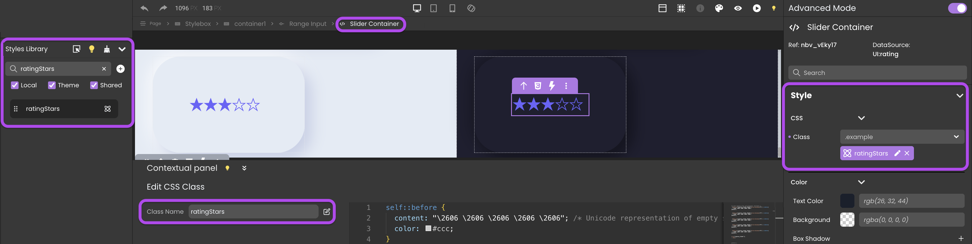
The provided example demonstrates applying a CSS class named ratingStars to the embedded element Slider Container of the Range Input component. This modification transforms the standard slider into a star rating slider, suitable for rating activities or services. The corresponding code for this CSS class is shown below:
self::before {
  content: "\2606 \2606 \2606 \2606 \2606"; /* Unicode representation of empty star */
  color: #ccc;
}
/* Fill the stars based on the 'aria-valuenow' attribute */
self:has( [data-cy="cypress_slider_thumb"][aria-valuenow="1"] )::before{
  content: "\2605 \2606 \2606 \2606 \2606";
  color: #6d5dfc;
}

self:has( [data-cy="cypress_slider_thumb"][aria-valuenow="2"] )::before{
  content: "\2605 \2605 \2606 \2606 \2606";
  color: #6d5dfc;
}

self:has( [data-cy="cypress_slider_thumb"][aria-valuenow="3"] )::before{
  content: "\2605 \2605 \2605 \2606 \2606";
  color: #6d5dfc;
}

self:has( [data-cy="cypress_slider_thumb"][aria-valuenow="4"] )::before{
  content: "\2605 \2605 \2605 \2605 \2606";
  color: #6d5dfc;
}

self:has( [data-cy="cypress_slider_thumb"][aria-valuenow="5"] )::before{
  content: "\2605 \2605 \2605 \2605 \2605";
  color: #6d5dfc;
}

self [data-cy="cypress_slider"]{
	position: absolute !important;
	width: inherit;
	opacity: 0;
}
The size of the stars is determined by the value specified in the Font category.
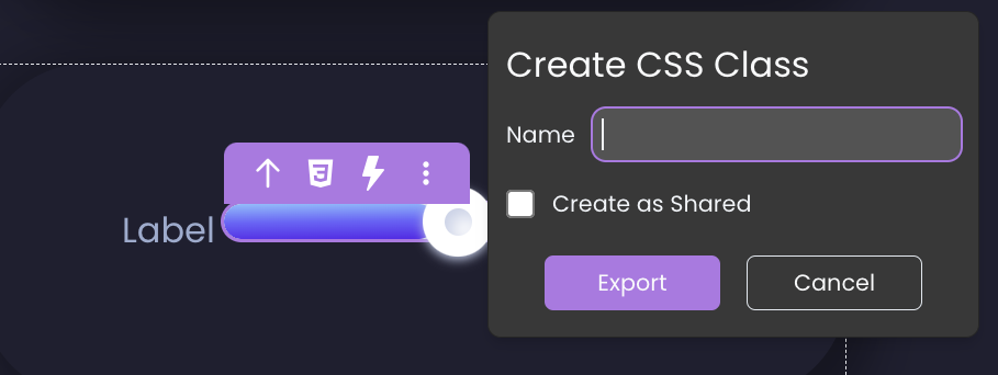
Exporting Styles as CSS Class
To reuse the style of a component, you can export it as a CSS class by following these steps:
- Select a component on the canvas, triggering the appearance of the tooltip.
- Click the CSS icon
 within the tooltip and provide a name for the new CSS class.
 - If you wish to export a shared CSS class, enable the
Create as Sharedoption. - Click the
Exportbutton.
This process exports only styles defined in the properties panel and not those from any other assigned CSS class.
Exporting styles instantly assigns the new CSS class to the component, removing the styles from the properties panel that are now defined in the assigned CSS class.
CSS Class Naming Priority
When assigning both a shared and a local CSS class with the same name:
-
The component is assigned both the local and shared CSS classes, regardless of the selection.
-
However, the shared CSS class takes precedence, and its styles are prioritized over those of the local class.
-
Consequently, if styles in the local CSS class are defined but not present in the shared class, they are still applied to the component.
When both css classes are assigned, the icon of the CSS class changes to symbolize that it is both local and shared. You can choose which one to edit from the dropdown list.
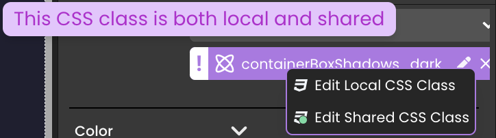
Qodly Studio permits the use of the same name for both a local and shared CSS class.
It does not allow the creation of CSS classes that resemble the name of a theme CSS class. More details can be found at Tailwind CSS.
Overriding Style Properties
A priority-based scenario determines which styles take precedence over others:
-
When assigning the theme CSS class
bg-red-500to a component, thebackgroundproperty displaysrgb(239,68,68). -
Subsequently assigning a shared CSS class to the same component, featuring a different background color, will override the initial value set by the theme CSS class.
-
A local CSS class takes precedence, prioritizing its styles over those of the shared class, thereby overriding the initial value set by the shared CSS class.
-
Modifying this value with another background color from the properties panel will lead to the theme, local and shared CSS classes being overridden.
Progress Bar
Displaying the Progress Bar
The Progress Bar is triggered when the front end anticipates at least one REST request response. This visual element is crafted to signify active server-side processes, offering a clear indication, particularly during the execution of REST queries.
Tailoring the Progress Bar
Customizing the appearance of the progress bar is facilitated through the following methods:
-
Creating a shared CSS class named
qodly-progress:self {
background-color: blue;
height: 20px;
} -
Creating a custom named CSS class and targeting the div element with the class
qodly-progress:div.qodly-progress {
background-color: blue;
height: 20px;
}
CSS Cascading in Page Loaders
When components like a button in a Page loader and another in the main Page share the same local CSS class name, unexpected style mergers can occur. This is a result of CSS cascading, where styles from the parent Page combine with those of nested elements, causing design inconsistencies.
<div class="fd-canvas fd-canvas--airy overflow-auto bg-white">
  <button class="fd-component fd-button localCssClass"></button>

  <div class="fd-stylebox fd-component relative p-2">
    <div class="fd-canvas bg-white">
      <button class="fd-component fd-button localCssClass"></button>
    </div>
  </div>
</div>
To prevent such issues, it's important to use unique class names, particularly in Pages with layered structures.
This issue is also prevalent in more complex Page arrangements, such as dialogs within Page loaders, where CSS cascading can lead to similarly unexpected styling challenges.
See also
If you're not familiar with CSS properties and styles, or you need a refresher, here are a few useful links and tools:
- Learn CSS on the MDN website
- A guide to flexbox properties on css-tricks.com
- Box-shadow examples, box-shadow generator