Tabs
The Tabs component is a versatile UI element designed to organize components within a tabs system, providing an intuitive way to navigate through different sections of your Page.
Each tab within the Tabs component includes an embedded Stylebox, fostering organized content structuring and alignment.
Use Cases
The Tabs component proves invaluable across a range of scenarios where content organization and easy navigation are paramount:
-
Multifunctional Interfaces: Implement the Tabs component in applications with diverse features or sections, such as dashboards. Users can quickly switch between different aspects of the application while enjoying a clear visual separation.
-
Form Navigation: Integrate tabs within lengthy forms or multi-step processes. Users can navigate through different sections of the form seamlessly, focusing on relevant data input without feeling overwhelmed.
-
Content Categorization: Apply the Tabs component to categorize and display content, such as articles or product listings. This enables users to access specific categories with minimal effort, enhancing content discoverability.
Properties Customization
Enhance the Tabs component to align with your application's requirements using the following customization options:
-
Variant Selection: Choose the variant that aligns with your design:
- Line Variant: Select the "Line" variant for tabs with an underlined styling effect.
- Enclosed Variant: Opt for the "Enclosed" variant to showcase tabs with a bordered presentation. This choice adds an additional layer of style to your tabs.

- Line Variant: Select the "Line" variant for tabs with an underlined styling effect.
-
Adding Tabs: Incorporate new tabs with ease using the intuitive tab management system:
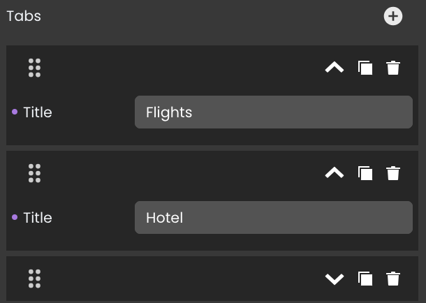
- Using the Plus Button: Add new tabs effortlessly by clicking the
+button within the Tabs component. Each tab can be individually configured, allowing you to fine-tune attributes such as:
- Title Customization: Modify tab titles to precisely reflect the content or functionality associated with each tab.
- Tab Duplication: Duplicate existing tabs to replicate configurations quickly by clicking on the
icon.
- Tab Removal: Delete tabs that no longer serve a purpose by clicking on the
icon.
- Moving Tab: Arrange tabs to your preferred position by clicking on the
icon.

- Direct Canvas Addition: Directly add new tabs onto the canvas using the
+icon.
- Using the Plus Button: Add new tabs effortlessly by clicking the
Data Integration
When it comes to data-binding, it's important to note that the Tabs component itself is not inherently data-bound. Unlike components like the DataTable that derive their content from specified qodlysources, the Tabs component primarily focuses on organizing and presenting content through clickable tabs.
Showcase
Although the Tabs component isn't inherently data-bound, you can still create dynamic, data-driven experiences by embedding components within each tab's Stylebox. Here's a glimpse of how the Tabs component will look and behave in action:

Triggers and Events
The Tabs component can respond to various events, enabling dynamic user experiences.
The webEvent command returns the involved tab index when called in an event function triggered by a Tabs component.
Events that can trigger actions within the component include:
| Event | Description |
|---|---|
| On Click | Calls for an action when the user clicks on the tab component. |
| On Change | Calls for an action when the displayed tab changes. |
| On MouseEnter | Calls for an action when the user's mouse cursor enters the area of the component. |
| On MouseLeave | Calls for an action when the user's mouse cursor exits the area of the component. |