Range Input
The Range Input component is a UI element enabling users to choose a numeric value from a defined range, or enabling developers to represent a value by a cursor positioned within a defined range.
The Range Input component contains embedded elements: Slider Container, Label, Filled track, Thumb, and Track. This is of great importance as configuring the Range Input component may require adjusting properties within the embedded elements. This applies to the visual style, triggers, and actions as they may differ.
Use Cases
Range Input component can be applied in various scenarios:
-
Volume Control: Use it to control audio or video volume levels.
-
Data Filtering: Implement it to allow users to filter results based on a numeric range, such as prices or quantities.
-
Configuration Settings: Utilize it for user-configurable settings that require selecting a specific numeric value within a range.
-
Visual representation: Display a value through a cursor within a range for a visual information.
Properties Customization
Range Input Component
Enhance the Range Input component to align with your application's requirements using the following customization options:
- Label Position: Developers can tailor the label's position, placing it above, below, to the left, to the right, or even hidden.
-
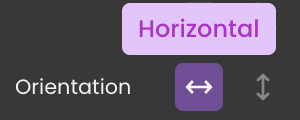
Orientation: Developers can choose between horizontal and vertical orientations for the Matrix. This choice affects the arrangement of Stylebox components and the presence of scrollbars.
- Vertical Orientation (Default): By default, the Range Input component is oriented vertically. This means that Slider container is stacked from top to bottom.
- Horizontal Orientation: When the Range Input component is configured with a horizontal orientation, Slider container is arranged from left to right.

- Vertical Orientation (Default): By default, the Range Input component is oriented vertically. This means that Slider container is stacked from top to bottom.
Embedded Label
Within the Range Input component, an embedded Label allows for further customization of the following properties:
- Label: Personalize the label to offer clear instructions or guidance.
Embedded Slider Container
Within the Range Input component, an embedded Slider Container allows for further customization of the following properties:
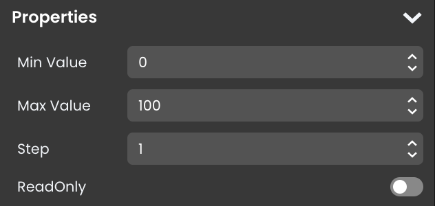
- Min Value: Set the minimum value that users can select within the range.
- Max Value: Define the maximum value that users can select within the range.
- Step: Determine the increment value when users interact with the component.

Embedded Filled track, Thumb, and Track
A slider object consists of these three elements, that can be customized separately:
They have a default design that can be customized using standard formatting properties, such as Background color and Height/Width.
The Display property allows to control how they are drawn:
- block: standard display, for example the thumb is a 14px white circle by default.
- flex: provides extra formatting properties.
- none: the element is not displayed; for example, you can hide the thumb
Data Integration
The Range Input component allows for seamless integration of Qodly Sources, enabling dynamic data binding and interaction within the Page.
The qodlysource for the Range Input component should be a numeric value.
Data Binding
To associate data with the Range Input component, follow these steps:
- Navigate to the Properties Panel: Access the Data Access category located within the Properties panel for the Range Input component.
- Define the Qodly Source: Specify the appropriate qodlysource that contains the data you want to display within the Range Input or retrieve from user input. This can be an attribute from an entity, an array, or a direct qodlysource of type number. For instance, you can select an entity, such as
dayplan.hotel_ID.

- Choose the Attribute: Choose the specific attribute that you want to display within the component when using an entity or an array type qodlysource, such as
dayplan.hotel_ID.rating.
Alternatively, you can establish the connection by dragging and dropping the qodlysource onto the Range Input component.
Server-Side Interaction
Interacting with user input data is straightforward. When you bind a qodlysource to the Range Input component, you can access and make use of the input content.
Subsequently, you can utilize this input value in various ways, such as within a standard action to initiate a search with matching attribute values.
Customizing Range Input Styles
The Range Input component provides additional customization options through CSS, allowing for a personalized appearance of its elements.
Component-Specific Classes
The following CSS classes are applied to elements within the Range Input component, defining their layout, style, and responsive behavior. Each class can be customized to adjust the look and functionality of specific parts of the component.
| Class Name | Applies To | Description |
|---|---|---|
fd-slidercontainer | Slider container | Wrapper around the slider track and thumb, controlling padding and spacing between these elements. |
fd-slider | Main slider container | Defines the main structure of the slider component, setting up basic layout and responsiveness. |
chakra-slider | Main slider element | Provides styling and positioning for the main slider element, including adjustments for focus and user interaction. |
chakra-slider__track | Slider track | Styles the visible slider track, controlling background color, height, and positioning of the track element. |
chakra-slider__thumb | Slider thumb | Styles the draggable thumb, setting properties like size, color, and border radius for the thumb. |
Component-Specific Tags
The following HTML tags make up the structure of the Range Input component. Each tag can be styled individually to adjust its appearance and interaction.
| Tag Name | Applies To | Description |
|---|---|---|
<label> | Container for the range label | Wraps the label text for the range input. Customizing the label with CSS can change its font size, color, and spacing, impacting its position and alignment relative to the slider. |
Component-Specific Attributes
HTML attributes within the Range Input component provide additional customization options, particularly for managing slider interactions and value display.
| Attribute Name | Applies To | Description |
|---|---|---|
aria-valuemin | Slider thumb | Sets the minimum value allowed on the range input. |
aria-valuemax | Slider thumb | Sets the maximum value allowed on the range input. |
aria-valuenow | Slider thumb | Indicates the current value of the slider thumb. |
aria-orientation | Slider thumb | Specifies the orientation (horizontal or vertical) of the slider. |
tabindex | Slider thumb | Manages keyboard navigation to make the slider thumb focusable. |
There is also the data-cy attributes that provide clear and consistent identifiers, ensuring that specific elements within the Range Input component can be reliably targeted and interacted with.
| Attribute Name | Value | Applies To | Description |
|---|---|---|---|
data-cy | data-cy="cypress_slider_filled_track" | Filled track | Identifies the portion of the track that fills as the slider is moved, often used in testing to confirm the value range. |
Example 1 - Slider Container
The self .fd-slidercontainer selector targets the main container for the slider, allowing customization of its size, cursor style, and shadow effect.
/* Slider container styling */
self .fd-slidercontainer{
  width: 100%;
  cursor: pointer;
  box-shadow: inset .2rem .2rem .5rem #c8d0e7, inset -.2rem -.2rem .5rem #FFFFFF;
  border-radius: 1rem;
  padding: 0 !important;
}
Example 2 - Slider Track
The self .chakra-slider__track selector styles the slider track, adjusting its height, border radius, and background.
/* Slider track styling */
self .chakra-slider__track{
  height: 100%;
  border-radius: 1rem;
  background: none;
}
Example 3 - Filled Track
The self [data-cy="cypress_slider_filled_track"] or the self .chakra-slider__track > :first-child selector targets the filled portion of the slider track, applying a gradient color that visually indicates the current slider value.
/* Filled track styling */
self [data-cy="cypress_slider_filled_track"]{
  background: linear-gradient(-1deg, #5b0eeb 0%, #6d5dfc 50%, #8abdff 100%);
}
Example 4 - Slider Thumb
The self .chakra-slider__thumb selector customizes the thumb of the slider, adjusting its size, shape, and shadow effect, and the self .chakra-slider__thumb::after selector adds a smaller inner circle to the thumb, creating a layered effect with additional shadows.
/* Slider thumb styling */
self .chakra-slider__thumb{
  width: 2rem;
  height: 2rem;
  border-radius: 50%;
  background: #FFFFFF;
  box-shadow: 0px .1rem .3rem 0px #bec8e4;
}
/* Inner circle for slider thumb */
self .chakra-slider__thumb::after {
  content: '';
  position: absolute;
  width: .8rem;
  height: .8rem;
  border-radius: 50%;
  box-shadow: inset .2rem .2rem .5rem #c8d0e7, inset -.2rem -.2rem .5rem #FFFFFF;
}
Example 5 - Slider Thumb Tooltip
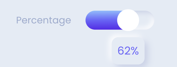
The self .chakra-slider__thumb[data-active]::after selector creates a tooltip that displays the current slider value above the thumb when active.
/* Slider thumb tooltip styling */
self .chakra-slider__thumb[data-active]::after {
  content: attr(aria-valuenow) '%';
  top: 40px;
  display: flex;
  justify-content: center;
  align-items: center;
  height: 2.5rem;
  width: 3rem;
  border-radius: .6rem;
  font-size: medium;
  color: #6d5dfc;
  box-shadow: .3rem .3rem .6rem #c8d0e7, -.2rem -.2rem .5rem #FFFFFF;
  opacity: 1;
  transition: opacity .3s ease;
}
Example 6 - Star Rating
In this example, the Range Input component is transformed into a star rating system using Unicode stars. The self::before selector creates an empty star display, and conditional styles fill in stars based on the slider’s current value.
To adjust the size of stars, select the component and modify its size.
/* Create the empty stars */
self::before {
  content: "\2606 \2606 \2606 \2606 \2606"; /* Unicode representation of empty star */
  color: #ccc;
}
/* Hide the slider but keep functionality */
self .fd-slidercontainer {
  position: absolute !important;
  opacity: 0;
  width: 130px;
  padding: 0;
}
/* Fill the stars based on the 'aria-valuenow' attribute */
self:has([aria-valuenow="1"])::before {
  content: "\2605 \2606 \2606 \2606 \2606";
  color: #6d5dfc;
}
self:has([aria-valuenow="2"])::before {
  content: "\2605 \2605 \2606 \2606 \2606";
  color: #6d5dfc;
}
self:has([aria-valuenow="3"])::before {
  content: "\2605 \2605 \2605 \2606 \2606";
  color: #6d5dfc;
}
self:has([aria-valuenow="4"])::before {
  content: "\2605 \2605 \2605 \2605 \2606";
  color: #6d5dfc;
}
self:has([aria-valuenow="5"])::before {
  content: "\2605 \2605 \2605 \2605 \2605";
  color: #6d5dfc;
}
Triggers and Events
Range Input Component
Events that can trigger actions within the component include:
| Event | Description |
|---|---|
| On Click | Calls for an action when the user clicks on the component. |
| On Keyup | Calls for an action when a keyboard key is released while the component is in focus |
| On KeyDown | Calls for an action when a keyboard key is pressed down while the component is in focus. |
| On MouseEnter | Calls for an action when the user's mouse cursor enters the area of the component. |
| On MouseLeave | Calls for an action when the user's mouse cursor exits the area of the component. |
| On Change | Calls for an action when the value of the Input changes. This typically occurs when the user enters or modifies text in the Input field. |
Embedded Label
Events that can trigger actions within the embedded icon include:
| Event | Description |
|---|---|
| On Click | Calls for an action when the user clicks on the Label. |
| On Keyup | Calls for an action when a keyboard key is released while the Label is in focus |
| On KeyDown | Calls for an action when a keyboard key is pressed down while the Label is in focus. |
| On MouseEnter | Calls for an action when the user's mouse cursor enters the area of the Label. |
| On MouseLeave | Calls for an action when the user's mouse cursor exits the area of the Label. |
Embedded Slider Container
Events that can trigger actions within the embedded icon include:
| Event | Description |
|---|---|
| On Click | Calls for an action when the user clicks on the Slider Container. |
| On Blur | Calls for an action when the Slider Container loses focus (user clicks outside). |
| On Focus | Calls for an action when the Slider Container gains focus (user clicks on it). |
| On MouseEnter | Calls for an action when the user's mouse cursor enters the area of the Slider Container. |
| On MouseLeave | Calls for an action when the user's mouse cursor exits the area of the Slider Container. |
| On KeyDown | Calls for an action when a keyboard key is pressed down while the Slider Container is in focus. |
| On Keyup | Calls for an action when a keyboard key is released while the Slider Container is in focus |
Embedded Filled track, Thumb, and Track
Events that can trigger actions within these embedded elements include:
| Event | Description |
|---|---|
| On Click | Calls for an action when the user clicks on the element. |
| On Keyup | Calls for an action when a keyboard key is released while the element is in focus |
| On KeyDown | Calls for an action when a keyboard key is pressed down while the element is in focus. |
| On MouseEnter | Calls for an action when the user's mouse cursor enters the area of the element. |
| On MouseLeave | Calls for an action when the user's mouse cursor exits the area of the element. |