Radio
The Radio component is an interactive UI element that enables users to make single or multiple selections from a predefined set of options. Users can choose one or more options using radio buttons associated with each value in the set.
Unlike certain other components, the Radio component cannot be linked to a qodlysource to display data, instead, options must be configured through the properties panel.
Use Cases
Radio component serve various purposes in user interfaces, including:
-
User Preferences: Select preferred theme, language, or notification settings.
-
Content Filtering: Filter content based on specific categories or criteriay.
-
Survey Management: Manage survey questions with predefined answer choices for collecting feedback and insights.
Properties Customization
Enhance the Radio component to align with your application's requirements using the following customization options:
- Type: Choose the appearance style of the radio buttons. You can select either "Radio" for standard radio buttons or "Tab" for a tab-like appearance.

-
Mode: The Radio Button component offers two distinct selection modes:
- Single Selection: Users can choose only one option at a time, ensuring that their selections are distinct and non-overlapping.
- Multiple Selection: Users can choose multiple options that are relevant to their needs.

- Single Selection: Users can choose only one option at a time, ensuring that their selections are distinct and non-overlapping.
- Default Value: Set a default value for the radio component, ensuring that a specific option is pre-selected when the component is loaded.
- Options:
-
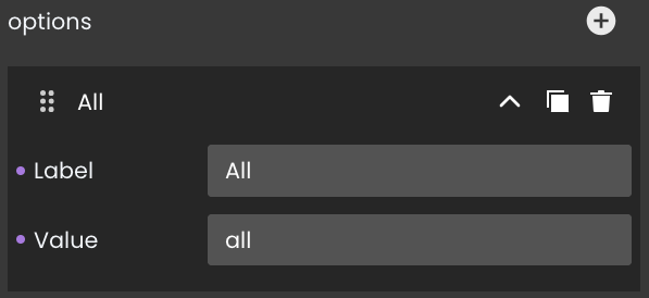
Adding Options: Incorporate new options by utilizing the "+" button within the Radio component. Each option can be customized with a label and a corresponding value, enhancing the clarity of user selections.
- Label: A descriptive text label for each option.
- Value: A distinct value to each option, enabling effective data handling based on the selections made by users.

- Label: A descriptive text label for each option.
-
Option Duplication: Duplicate existing options to replicate configurations quickly by clicking on the
icon.
-
Option Removal: Delete options that no longer serve a purpose by clicking on the
icon.
-
Moving Option: Arrange options to your preferred position by clicking on the
icon
-
Data Integration
The Radio component captures and reflects the user's choice within this set.
The Radio component provides selections from a predefined set of options within the properties panel, without relying on qodlysources.
Data Binding
To enable data capture for the Radio component, follow these steps:
- Navigate to the Properties Panel: Access the Data Access category located within the Properties panel for the Radio component.
- Define the Qodly Source: Specify the relevant qodlysource that will capture the user's selected choice.

Alternatively, you can establish the connection by dragging and dropping the qodlysource onto the Radio component.
Server-Side Interaction
Retrieving user choices is straightforward. By binding a qodlysource to the Radio component, you can access and utilize the selected content.
For example, when users make a single choice from a set of options, binding a qodlysource captures the selected option.
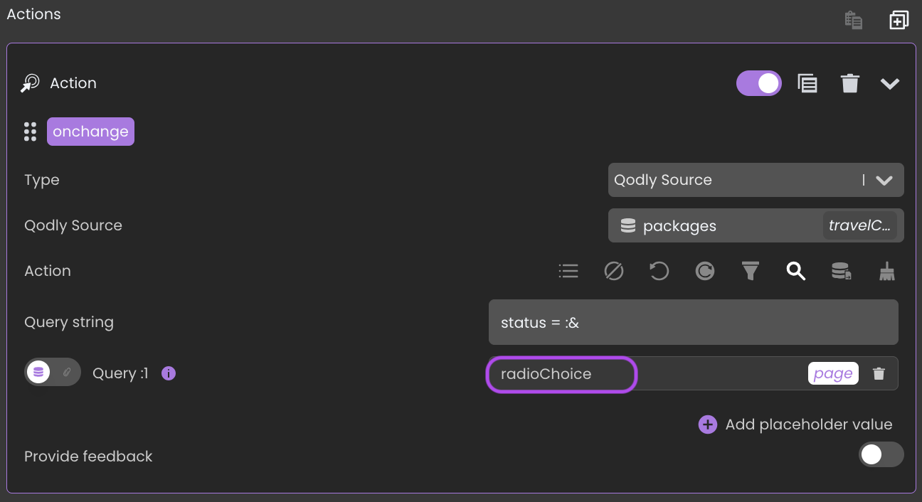
Consequently, you can utilize this option value in various ways, such as within a standard action to initiate a search with matching attribute values.

Additionally:
The Radio component's qodlysource can also be linked to the value of an attribute in the currently selected entity of another qodlysource. This enables the component to automatically display the saved value of the selected option whenever a new entity is chosen.
Customizing Radio Styles
The Radio component offers additional customization options through CSS, providing control over the appearance of radio elements.
Understanding Radio CSS Classes
The Radio component supports various CSS classes that enable the customization of radio item appearance. Below is a detailed list of supported CSS classes and the elements they apply to.
| Class Name | Applies To | Description |
|---|---|---|
.fd-radio__item | The entire set of choices | Styles all the radio elements. |
.selected | The selected choice | Applies to the radio option that is currently selected. |
Custom styling examples
The following examples demonstrate how to customize the Radio component's appearance.
Example 1: Shadowed Radio Items
In this example, all radio choices are styled with a white background, rounded corners, and shadow effects to add depth. The text is centered and the color is set to dark blue for contrast.
self .fd-radio__item {
color: rgb(6, 2, 37);
border-radius: 5px;
padding: 8px;
width: 80px;
background-color: white;
margin:5px;
text-align: center;
font-weight:bold;
box-shadow: 4px 4px 10px rgba(215, 218, 225, 0.9), 4px 4px 10px rgba(221, 221, 232, 0.9), 4px 4px 10px rgba(240, 240, 244, 0.9), 4px 4px 10px rgba(227, 227, 234, 0.9);
}
Example 2: Italicized Selected Radio Item
This example customizes the selected radio item by setting its background color to a muted green with a cursive font and italicized style.
self .fd-radio__item.selected {
background-color: rgb(124, 146, 115);
font-family: cursive;
font-style:italic;
}
Example 3: Green Hovered Radio Item
In this example, the hovered radio item is customized with a soft green text and a shadow effect to add depth.
self .fd-radio__item:hover {
background-color: white;
box-shadow: 4px 4px 10px rgba(215, 218, 225, 0.9), 4px 4px 10px rgba(221, 221, 232, 0.9), 4px 4px 10px rgba(240, 240, 244, 0.9), 4px 4px 10px rgba(227, 227, 234, 0.9);
font-weight: 500;
color:rgb(124, 146, 115);
}
Showcase
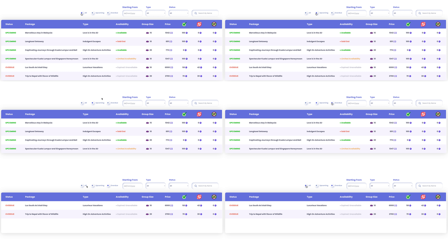
Here's a glimpse of how the Radio component will look and behave in action:

Triggers and Events
The Radio Button component primarily responds to the "On Change" event, triggering actions when users select different options. This interaction allows you to create dynamic and responsive interfaces based on user choices.