Overview
Development in Qodly relies on the use of Qodly Studio, an innovative platform for creating business web applications. Our primary goal with Qodly Studio is to provide developers with a seamless, 100% web-based development experience. This platform empowers developers to:
- Design and modify data models that align with your business logic.
- Effortlessly link data with ORDA dataclasses.
- Visually craft Pages by simply dragging and dropping components onto a canvas.
- Instantly preview web pages.
- Execute QodlyScript code directly within web events or qodlysource events.
- Write and debug code directly within the browser.
- Fine-tune privileges and roles as per your requirements.
Ultimately, Qodly Studio allows developers to build comprehensive web-based business applications using just a web browser, significantly minimizing the need for extensive coding. Importantly, JavaScript is not a mandatory component in this process.
Requirements
For development purposes, Qodly Studio supports the following web browsers:
- Chrome
- Edge
- FireFox
It is recommended to have a screen resolution of 1920x1080 for an optimal experience.
Deployed Qodly applications are accessible on all popular web browsers, with no specific requirements.
Accessing Qodly Studio
Access to Qodly Studio is granted to developers once they complete a series of authentication steps to enter the Qodly Cloud Management Console. From the Development or Staging environment within the Qodly Console, you can access your application instance in Qodly Studio by either:
- Clicking on the Studio button on the Overview page.
- Clicking on the Studio URL in the General tab for the environment.
Qodly Studio Home Page
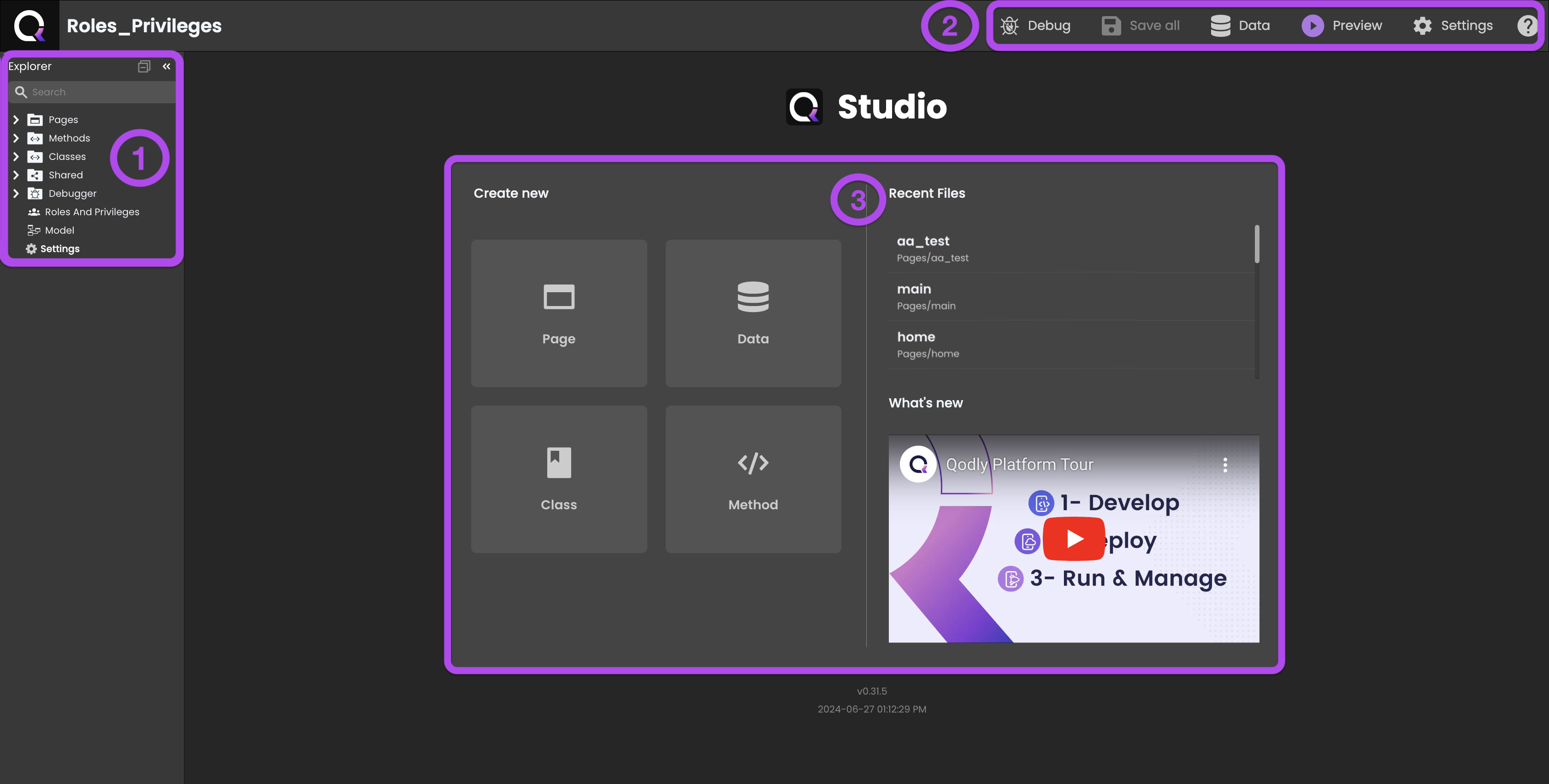
When you first step into Qodly Studio, you'll immediately encounter a user-friendly interface. It's divided into three key sections: the Explorer ⓵ on the left, a Header bar⓶ at the top, and a Grid container⓷ in the center.
-
Explorer: is where you'll find an overview of your project's essential elements:
 Pages: Serve as containers, enveloping various components within your application.
 Methods: Function as distinct blocks of code that fulfill specific roles within your application. While they can be invoked from class functions or other methods, components can't directly interact with them.
- Classes: Serve as the cornerstone for organizing your code around objects, granting components the capability to directly interact with them.
 Shared: Use this folder to store any contents (local images, downloadable files...) you might need within your app. The contents of this folder can be accessed from Qodyy pages using the
 /$sharedlink or from the QodlyScript language using the/SOURCES/Sharedfile path. Debugger: Provides a suite of debugging tools that address different types of errors during the development phase.
 Roles And Privileges: Plays a pivotal role in enforcing data access restrictions within your application, ensuring that the right users access the right data.
 Model: Defines how data is accessed and stored within structures referred to as datastore classes.
 Settings: Offer options to configure application-specific settings.
-
Header bar: provides quick access to several project-related options:
 Debug: Initiate a debug session on the server, attaching it to your browser, and enable debugging for your app.
 Save All: Save all changes made across all open windows within your app.
 Data: Provide access to the Data Explorer, facilitating data-related operations.
 Preview: Allows you to assess your application's appearance and functionality with ease.
- Settings: Present a range of options for configuring application-specific settings, tailoring the environment to your app's needs.
-
Grid container: houses a collection of swift shortcuts for a range of actions:
-
Create New: Offers convenient quick links for:
- Pages: Speedily initiate the creation of a new Page.
- Classes: Generate a new Class.
- Methods: Generate a new Method.
- Data: Provide access to the Data Explorer, facilitating data-related operations.
-
Recent Files: Displays the most recently accessed files, allowing you to quickly revisit your recent work.
-
What's New: Keeps you updated with the latest news and announcements from the Qodly team.
-
Tabs
Qodly Studio displays open items with tabs in the title area above the current editor.
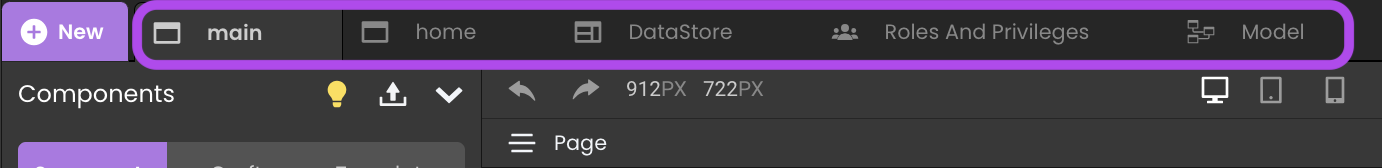
By default, when you open a file, a new tab is added for that file. New tabs are added to the right of the existing tabs. All Qodly files and editors use tabs: model, Pages, methods, classes, roles and privileges, settings, pictures, and so on.
Tabs let you quickly navigate between items and you can drag and drop tabs to reorder them. Only one instance of an item can be open in the same editor window.
When you have more open items than can fit in the title area, you can use the scroll bar between the tab and editor regions to drag tabs into view.
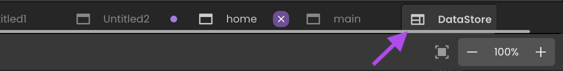
Contextual menu
Every tab provides access to a contextual menu that you can display with a right-click on the tab header:
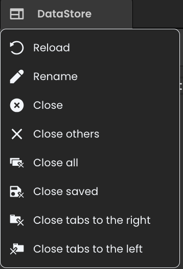
The following actions are available:
- Reload: reloads the tab contents from the server
- Rename (not available with non-editable tabs such as Roles and Pivileges): makes the tab heading area editable so that you can rename the opened file.
- Close: closes the current tab and its associated file.
- Close others: closes all the opened tabs except the current one.
- Close all: closes all the opened tabs.
- Close saved: closes all the tabs that contain saved contents. Tabs with unsaved contents are not closed.
- Close tabs to the right/to the left: closes all opened tabs located at the right side or the left side of the current tab.
- Switch to Text Editor (only available with Page and model tabs): displays the current Page or model as JSON text. When called from the text editor, the menu command toggles to Switch to Page Editor/Switch to Model Editor.
Unsaved contents
When the contents of a tab has been modified locally but has not been saved, a colored spot is displayed on the right part of the tab header:

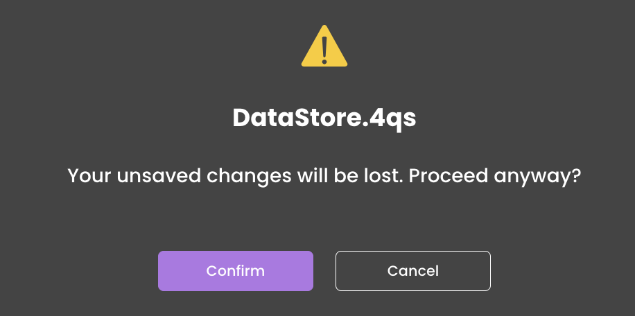
When closing or reloading a tab, if it contains unsaved changes, an alert window is displayed, allowing you to ignore the changes and close the tab (Confirm) or cancel the closure and let you click the Save all button to save the changes.
Preview mode
By default in Qodly Studio, clicking a file in the Explorer automatically opens it in a new tab, if not already opened. This can lead to open a large number of tabs.
If you are browsing multiple files and don't want every opened file to have its own tab, you can enable the tabs preview mode using the Activate tabs preview mode selector of the User Settings.
When the tabs preview mode is enabled, clicking a file in the Explorer displays a preview of its contents and reuses an existing tab. If you start editing the file or use double-click to open the file from the Explorer, a new tab is dedicated to that file.
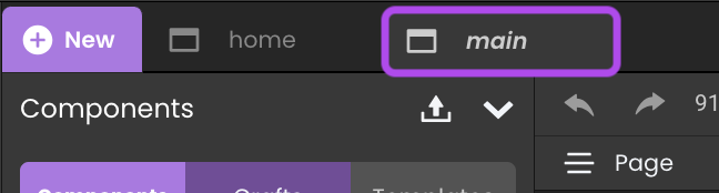
Preview mode tab is indicated by italics in the tab heading:
If you'd prefer to not use preview mode and always create a new tab, just let the selector off (default mode).